26 December 2019

Link roundup for December, 2019

Ford and colleagues analyzed presentations by under-represented minorities (URMs) at the American Geophysical Union (AGU) Fall meeting (one of the biggest conferences, along side Neuroscience).

The AGU presentations fall into three categories. People can be invited to give a talk (“Invited” in the graph below). Researchers can submit abstracts, and session organizers decide whether it is a talk or poster (“Assigned” in the graph below). Or people can just decide to give a poster.

They found a strong and consistent pattern: under-represented groups were consistently giving more posters than other groups.


(S)cientists from under-represented racial and ethnic minority groups had the smallest chances of being selected and invited to speak, and opted for poster presentations more often than did their peers. ...

We did not investigate why URM geoscientists applied to give only a poster more often than did others overall, and at every career stage. There could be several reasons. People might be held back by psychological factors such as lower self-confidence. ... Or, some URM scientists might value poster presentations — this format could align with different goals, interests or lived experiences, for example by enabling researchers to communicate findings in one-on-one conversations.

I greatly appreciate that the authors mentioned that people might want to give posters! (See below.) But even I, a big advocate of poster sessions, know that most people consider talks more prestigious than posters. I personally think this should not be the case, but there it is.

The imbalance in the other categories can’t be easily explained by presenters’ personal choices, however. They are strong indicators of biases in conference organization that should be addressed.

Hat tip to Cailin Gallinger.

• • • • •

I missed this blog post from May about why poster sessions are the best part of conferences.

During the lecture session, attendees learn from the speakers, but since question time is almost limited, it is unclear what to do with unanswered questions. This is where the poster sessions come into play as a solution to this problem. Usually the lecturer is the lab head and lab members present posters. We can ask them in detail without time limit as long as the post presenter is happy and patient enough with us.

• • • • •

The notion of what to wear in an academic setting (including poster sessions) is a fraught one for many women, as by the reaction to Dr. Emma Beckett’s dress.


The Sydney Morning Herald has an excellent summary of the discussion raised by the “vegetable dress” here.

• • • • •

This journal article by Sousa and Clarke reinforces many points on this blog. Their six main points:

  1. Don’t copy most other posters
  2. Nail your key messages
  3. Hone your messages and context for the audience
  4. Conceptualize your poster design
  5. Create your poster, then get feedback
  6. Learn from every other poster

• • • • •

Andreas Mรผller won the award for “Best teaching project” poster at the MAXQDA International Conference. Click to enlarge!


Andreas helpfully has a substantial blog post describing some of the considerations that went into making his poster. For example:

No one will read your poster from beginning to end. No one. If we have accepted this fact, our posters will become much better. 

Some headings from the post:

  • “Don’t put too much text on your poster!”
  • Create several points of entrance
  • Use questions as headlines
  • Posters are a chance to connect
  • Give your poster a digital afterlife

• • • • •

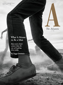
The Atlantic magazine recently underwent a redesign.

Cover of The Atlantic magazine

The Atlantic’s design team turned to the magazine’s history for inspiration. The result is what feels like a deliberate step back from the norm of web-conscious print design, into an old-school aesthetic whose gravitas is buttressed by a print legacy of over 160 years.

It’s interesting to compare this redesign to the one Nature did recently, which I mentioned back in October. Both include completely custom typefaces, for example.

• • • • •

I love Amy Tabb’s notion that a conference is “scientific camping.” How to pack for a conference.

• • • • •

One of the items on James Heathers’ list of things that help make a conference great:

- local poster printing

This is a good point. Some conferences are in places with “business centers,” but large format printing is a little bit specialized and not available everywhere. Conference organizers would do well to try to find if emergency poster printing is available nearby.

• • • • •

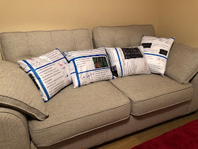
I always love sharing fabric poster arts and crafts.

Couch with four cushions made from fabric conference poster

This fine example from Steve Royle.

• • • • •

Johannes Wirges argues that board games teach you how to visualize data.

Picture of War Chest board game by AEG

Board games tend to use easily readable encodings of data. Categorical data is usually encoded via color hue and shape. This goes, for example, for the different kinds of meeples controlled by each player. Numerical data is usually encoded via location among common axis, number of elements, and size of elements. Board games seldom include more difficult to discern encodings like shades of a color hue (light to dark) or orientation.

• • • • •

I will end with this from Spider Robinson:

The whole world turns upside down in ten years, but you turn upside down with it, so to you it’s right side up.
- The Time-Traveler, Callahan’s Crosstime Saloon


The world turned upside down for me, and it’s only with effort that I can realize it did.

This is the last post of... the decade. When the decade started, this blog had been in play for less than a year. Now, going into 2020, a book based on the knowledge I’ve gained in 10 years of blogging is completed and will be out at the start of next year.

Having a book coming out next year is both wonderful and nerve-wracking. I am looking forward to you having the chance to read it sometime in the next decade.

19 December 2019

”Why did I lose?” Making poster competitions better


Many conferences have poster competitions. Lots of people like to compete, and it often brings out people’s best efforts. I have been pleased to show lots of competition winners here on the blog.

But often, neither winners or losers know why they are winners or losers.

Some conferences have the judges’ scoring rubrics available for the competitors before the conference. This is good practice, because it helps people know what targets they have to hit. Different people have different ideas about what makes a good poster, and that’s fine, but competitors  should be rewarded for reading instructions! (Including rubrics.)

But typically, the award winners are announced at the very end of the conference, after posters have come down. Nobody gets to go back and see the winning posters. And there is no feedback at all for any of the entrants. The scores and comments compiled by the judges usually just stay with the organizer of the contest. The contest winner is a fact in a vacuum, with no context and no opportunities for people to learn.

Here’s what could be better.

Announce the winner before the end of the conference. Put the winning posters somewhere prominent so people can easily find them and see them. Put a little note card explaining the judges’ summary assessment of the poster.

Give all presenters their score sheets (if they want them), so they can see their scores and comments. Let the presenters know who the judges are so they can follow up with questions if they so choose.

In the society newsletter and website — hell, the society’s journals if it had one — feature the first place poster, second place poster, and any runners up. Again, include commentary from the judges. Perhaps include commentary from the poster designer, too, explaining how they did what they did.

Over time, the society’s website should develop a gallery, easy to find, with each year’s “best of” conference posters and competition winners.

As I said last week, posters will stay horrible if we don’t develop a body of work that people can look at, learn from, and improve upon. Providing this sort of detailed commentary to people, showcasing the winning posters, and explaining why it won starts to develop that body of work in a field.

Hat tip to May Gun on Twitter (https://twitter.com/may_gun/status/1207006302074916871) for the prompt for this post.

12 December 2019

Posters will stay bad unless we start building continuity of work

In six pages, Richard McGuire changed comics.

In 1989, McGuire created a six page experimental comic called “Here.” The gimmick was that each panel showed a single place, but sub-panels showed that place at different times.


(McGuire later expanded on the idea with a longer graphic novel.)

McGuire did something that nobody else had done before. The avant garde effect expanded the vocabulary of comics. Cartoonist Chris Ware said it blew his mind.

(McGuire) took the X-Y vectors of comics and added a Z axis to it. And he was the first cartoonist to suggest that you could overlap panels of time over the same point in space. And that strip, for lack of a more effective vernacular expression, truly blew my mind and really changed the way I thought both about comics and the world itself.

I bring this up because I’ve been thinking about why poster design continues to be so bad after fifty years.

Other visual media, like comics or movies, become more sophisticated over time. Compare comics and movies from the 1930s to their 1980s descendants, fifty years on. The 1930s works look stilted and turgid. The 1980s efforts are more dynamic and interesting.

This can happen partly because there is continuity of work and practitioners. When one person innovated, others imitated. McGuire influenced Ware and who knows how many others.

Posters haven’t had the benefit of that continuity. They will always stay bad unless there starts to be a recognized body of work that people can see and build on. More posters need to be archived in simple, convenient format. And we need to start curating the “best of the best” posters so people can see what is possible in the format.

Related posts


External links

Chris Ware and Chip Kidd interview
Here 1989
Here 2014
Here ebook
Richard McGuire: Here

05 December 2019

Disposable design

One of the arguments I sometimes see is that nobody should care about conference poster design, because posters are “disposable.”

Counterpoint.

My friends, have you ever used cheap toilet paper?

Did the fact that it was “disposable” mean you didn’t care about the experience of using it?

Probably not. You probably cared about how easy it was to start the roll, and probably cared a lot about how it felt when you used it.

I would image that people have similar feelings about using poorly designed tampons or condoms.

Now, I know that the experience of a conference poster is not like using a product that is meant for close contact with body parts in the “swimsuit zone.”

But just because something is used once is no excuse for poor design. Nor is it a reason to mock people for caring about their experience with something.

28 November 2019

Link round-up for November, 2019

Caroline Bartman made me laugh:

Poster sessions are wild

It's like, do you like papers?

In that case you will really like traveling hundreds of miles to look at rough drafts of paper figures in a large ballroom

The responses are also interesting, mostly from poster haters.

• • • • •

Speaking of conference haters, ELiot Berkman answered the question, “What is something you believed to be true earlier in your career that you no longer think is true?” with this:

I now believe that travel (e.g., for conferences) is almost never worth it because of the incredibly high opportunity cost. No talk or poster is worth what ends up being a full week of otherwise productive work time.

This response is interesting in two ways.

  • It defines “work” very narrowly.
  • It comes from someone whose lab is publishing about ten papers a year. It’s easy to forget that not everyone has that long a CV.

• • • • •

Shawn McGuirk has a request for conference organizers:

Public Service Announcement: It’s not OK to cut the poster session at a conference if talks are going way over time.

That’s 90% of conference content (of mostly trainee work) being squashed to make space for the 10% (of mostly tenured profs) who did not keep to time.

Whatever this happened, for shame. I have never had this experience, after many years of going to one or two meetings a year. But Shawn has seen this multiple times.

The one exception was a Keystone conference last February... However at that conference all the PIs decided to completely skip the poster session on day 2 to go out for dinner together.

The more I heard, the more I was like, “Rise up comrades! Reclaim your glorious poster session time!”

• • • • •

More things for conference organizers to be aware of: what you put in “graveyard slots” in conferences.

The ‘graveyard slot’ at a conference is a session which, due to the timing of the session, has a high probability of low attendance.

A new paper describes authors who organized a session that was put into a “graveyard slot,” and it was ultimately cancelled.

This is not sour grapes. Pretty much every meeting I go to has a huge drop in attendance on the last day, and someone has to present there. The Animal Behavior Society gave out “Omega awards” for the last talk of the conference, in recognition that the last speakers kind of got screwed by being scheduled there.

There is a clear equivalent for poster sessions: the “dead zone” at the back of the hall,” furthest from the doors. At Neuroscience, these are sessions like “History and teaching of neuroscience.” It’s a shame, because sometimes those posters are some of the most offbeat and intriguing ones.

So it’s worth program organizers to be transparent about how where posters are placed and how events are scheduled.

Hat tip to Ben Marwick and Kristina Killgrove.

• • • • •

Margaret reminds us that it’s important to include people in conference conversations:

Conference pro tip: If in a group setting and you see someone having difficulty joining the convo, make an effort to include them. It’s usually easy to say “I don’t think we’ve met, I’m X. What’s yours?” OR if you know them, “Hey X, tell me what you’ve been up.”

• • • • •

There is a free font based on the handwriting of the forty-fifth American president.


You can download the font, Tiny Hand, here. Hat tip to John Wick.

• • • • •

Speaking of type, I mentioned an episode of Abstract on type design last month, featuring Jonathan Hoeffler. Emerging from that episode is a compendium of visual illusions that affect type design.

Hat tip to Melissa Vaught.

21 November 2019

Why established academics should make their own posters

Stay in the game. Women fottballer getting tackled.

This one is for the people who are now full time academics, scholars, scientists, and “PIs.”

Keep making your own posters.

For many people, a poster is their first presentation. But sometimes there is a tendency to think of posters like the kiddie table. As people “grow up” (academically), there’s an expectation that you’ll progress to slide talks and oral presentations. The senior people sometimes give very few talks, unless of course they’re invited to give a keynote.

This pattern contributes to why so many conference posters are so awful.

My first poster presentation was in 1991, and I made them regularly since then. When I look back to some of the posters from the 2000s – posters I made with the benefit of more than fifteen years of experience but before I started this blog – some of them posters are pretty shocking.

This poster, for instance, was the twenty-eighth poster listed in my CV:

Poster abou crayfish with lots of text.

All that experience, and my posters were still intimidating blocks of text that looked like a journal vomited on a page. And I started this blog in part because I had some confidence that I maybe had a slightly better handle on design than average, had something useful to say, and could help others. But my skill level wasn’t that high.

And the moral of the story is: Design takes practice.

If you stop making posters after grad school, you are missing the opportunity to keep improving your posters and skills.

It stops posters from getting more polished and sophisticated, and makes everyone unhappy when they go to a poster session and see a bunch of poorly thought out posters that nobody wants to look at.

That’s not only a disservice to yourself, but a disservice to the research community and particularly a disservice to your students.

The poster format can become better, but only if the most experienced practitioners stay in the game and don’t foist the job off to students.

14 November 2019

Critique: Cells grow after fly sex

This week’s poster comes fro Josephine Hellberg. This work was recently published (Leiblich et al. 2019), so Josephine was able to set her poster free for others to see! Click to enlarge!


Josephine wrote:

I wanted to keep the poster to-the-point and only highlight the one, key result that came out of my PhD work, and keeping it as simple as possible. I was quite pleased with the poster at the time, but now, when I look over it with fresh eyes, I realise that I probably didn’t go far enough in making the poster self-explanatory. But I like how little information I managed to put onto it and still tell a story: I’m more interested in the stories than the background when looking at posters myself, and I wanted to reflect this. (In case of interest, people can always go to the research paper(s) themselves.)

Josephine put lots of good principles in play here. You have a big graphic up at the top left, where people look first. That it’s circular helps make it stand out more.

Following the circle, the boxes have rounded corners. The fortunately, the corners are rounded by about the same amount, so there is consistency across the entire page. Likewise, the colour scheme seems to draw from the microscope images and is consistent throughout.

There is a very high proportion of visuals to text. The images within individual boxes are generally aligned well.

The bottom right has a clearly labelled conclusion, and the logos and fine print are also down at the bottom, not competing for space in the title bar.

And this biology pedant gives 1,000 points for listing the name of the fly with its specific epithet, not just “Drosophila.” Though I’d have given 5,000 points if the genus name was spelled out in full, and 10,000 points if the title included a plain English name like “fruit flies.” (But don’t worry, the points don’t matter, as they always said on Whose Line is is Anyway?)

Drew Carey saying, "That's right. The points don't matter."

There aren’t too many things I would try to do differently.

The title of the poster is a little under emphasized, for two reasons. First, the image right next to it draws the eye more effectively than text. Second, the type for the title and headings is Century Gothic (or a close relative). As I’ve mentioned before, this typeface has some issues for posters: the strokes are thin and the shapes of different letters are very similar.

At the very least, using a bold weight might have been worth a try. Bold weight would have probably required some finessing for the section headings, given that the heading isn’t much narrower than the box it is in.

Related posts

Critique: Cubic slip-systems

Reference

Leiblich A, Hellberg JEEU, Sekar A, Gandy C, Mendes CC, Redhai S, Mason J, Wainwright M, Marie P, Goberdhan DCI, Hamdy FC, Wilson C. 2019. Mating induces switch from hormone-dependent to hormone-independent steroid receptor–mediated growth in Drosophila secondary cells. PLOS Biology 17(10): e3000145. https://doi.org/10.1371/journal.pbio.3000145.

07 November 2019

Critique: Crayfish cell culture

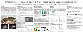
“Here’s one we did earlier,” as they say on the cooking shows. This was a poster I did in 2018 for the International Crustacean Congress in Washington, DC, and the paper is now out as a preprint. Click to enlarge!


I had seen lots of posters that used white text on black effectively. I decided this was my turn to try it. The background is not a “pure” black, however. It’s more a very dark brown. I used the eyedropper tool to pick a dark colour from the central picture of the crayfish. Likewise, the large text is not pure white, but a slightly off-white picked up from some of the gravel. The consistence of colour helps tie the poster together.

The amount of text on the poster is higher than I would like. But because the point of this poster is to describe a method, it’s either a set of instructions written in sentences, or a flowchart. I took the coward’s way out and wrote it out.

The combination of a lot of text with the square format necessitated some tough choices in typography. I either needed a small point size or a narrow width font, and I chose the latter (Noto Sans Condensed Light). I think the white text on the dark background “pops” enough to make the ext readable.

The typeface for the title and headings is Bernhard Modern, which has been the logo for the Marmorkrebs.org website for many years. Since Marmorkrebs is the species featured on the poster, might as well have consistency.

You might wonder why there is a figure in the right column above the “Results” heading. The figure is a result, so shouldn’t it be under the heading? Logically, yes. Visually, I much preferred aligning the pictures. Here’s an earlier draft with the more traditional heading placement (and a more traditional “dark on light” colour scheme.


The final version looked more solid, because the tops of the pictures now align and the “Cell culture method” and “Results” headings align. The introduction, central picture, and left picture create a section running across the poster horizontally that doesn’t disrupt the column flow.

Having more than a year since I’ve worked on this poster, there are a few things I might do differently now.

The title is too ambiguous. One of the lessons I have recently learned about headlines is that they should always make sense out of context. “A new method for cell culture from a cloning crayfish” would be longer, but would stand alone more effectively.

In retrospect, I probably should have made the text ragged right instead of fully justified. And I’m sure that if I kept editing, I could have fit the text in using a regular weight font instead of light.

Reference

DeLeon H III, Garcia J Jr., Silva DC, Quintanilla O, Faulkes Z, Thomas JM III. Culturing embryonic cells from the parthenogenetic clonal marble crayfish Marmorkrebs Procambarus virginalis Lyko, 2017 (Decapoda: Astacidea: Cambaridae). Journal of Crustacean Biology: in press. https://doi.org/10.1093/jcbiol/ruz063

01 November 2019

The manuscript is done

As part of this blog’s tenth blogiversary, I mentioned that I was working on a poster design book. Yesterday, I submitted the manuscript of that book to my editor at Pelagic Publishing.

The book is mostly about design, but it expanded to be about more than just design. It became about the larger poster experience and how you can learn a lot about academia by understanding posters.

If all goes well, you will be able to buy Better Posters: The Poster Presentation Book sometime in the first three months of 2020. I’ll keep you updated here.

31 October 2019

Link round-up for October 2019

Since this link round-up happens to fall exactly on Halloween, I must start with a font for the season. Hellvetica. Courtesy of Zack’s Bad Jokes.


This isn’t just a mock-up, this is a real TrueType font you can download. If you dare.

(But seriously, download it now in case there’s some copyright violation case that’s launched at this is taken down.)


Hat tip to Mike Nitabach.

• • • • •

Hey! Established researchers! Give your own poster presentations!

Seeing super-famous PIs presenting posters at Biology of Genomes was a formative moment for me.

That reminder of the importance of being “down in the trenches” from Michael Hoffman.

• • • • •

Coincidentally, a recent meeting at Cold Spring Harbor made senior researchers give posters. Dan Tracey gave this poster:


Dan wrote

A policy to promote early career scientists meant nearly every talk at #cshlDros was by a grad student, postdoc or new PI. This made for a fantastic meeting, with the people DOING the actual exciting new work telling us about it. This “senior person” gave a poster!

• • • • •

If people don’t come to the poster, the poster must come to the people.


Spotted by Joe Parker. Hat tip to Heidi Smith Parker.

• • • • •

Marilia is keeping track of her favourite scientific posters by threading them together on Twitter.

Over twenty examples to inspire! Here’s just one:


• • • • •

The journal Nature has been given a redesign, all the way from the logo to an entirely new custom typeface. Kelly Krause does a fantastic job of explaining the process here. SHe also has a Twitter thread that includes a few more details that aren’t in the main article.


Hat tip to Martin Krzywinski.

• • • • •

Speaking of logos, Megan Clement starts describes this logo thus:


The French Olympic logo tumbles out of bed on a Parisian morning. She tousles her messy bob, dons breton stripes and ballet flats and whisks down the stairs from her fifth-floor apartment to grab a baguette before enigmatically texting two men who are pursuing her romantically.

The thread continues from there.

• • • • •

A networking tip to avoid embarrassment on your part and annoyance of the person you’re talking to:

Don’t try to guess someone’s job/career stage by what you guess their age to be! Just ask them, “Hey, what organization do you work for? What kind of work do you do? What are you most excited about in your job?”

These are great ways to get to know them. Without any assumptions about their career stage (since age and career stage are not the same thing, we all move through those stages differently.)

And you’ll probably hear cool stuff that they are excited to talk about!

From Auriel Fournier.

• • • • •

The Netflix series on design, Abstract, just dropped its second season. The episode so far that seems most relevant to poster design is an episode featuring Jonathan Hoefler. There is some cool stuff on how type has to be designed to take visual illusions into account. It’s a nice reminder that design isn’t math.

Jonathan Hoefler

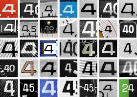
One of the threads in the episode is the creation of a new typeface based on watchfaces, which was just released as Decimal.

Number "4" from many vintage watchfaces


The process of creating Decimal is also described at Heofler’s own website, Typography.com.

The Abstract episode about Instagram also looks like it may have a few gems.

• • • • •

Sam wondered if people want conference memorabilia.

For every person who liked the swag, five people said the organizers should put the money elsewhere. There were over 7,500 votes in the poll, so this seems a solid answer.

• • • • •

This graphical abstract would work great as a poster:


Created by Rafeal Missagia. Hat tip to Milton Tan.

(Searching for this abstract led me to this one. Which is... I don’t know.)

• • • • •

The Canadian National Institute for the Blind (CNIB) has a Clear Print Guide (direct link to PDF here) that covers some basics about designing for people with visual impairments of various sorts.

It contains at least one tip I had not thought of before. The choice of paper affects accessibility. Glossy paper looks sharper, but creates glare that could obscure the printed content for people who have difficulty seeing.

Hat tip to S. Lewis Simpson.

• • • • •

Lincoln Michel tweeted a taxonomy of type:


Brings a whole new meaning to alignment. Hat tip to Melissa Vaught.

• • • • •

We have nominees for worst poster ever and worst poster presenter ever. These two things are connected, not surprisingly. At the Geological Society of American 2019 meeting, Jane Willenbring wrote:

A man who presented an entire poster at a meeting about me being unethical for reporting sexual harassment is now at a conference with me.

In response to a query, Jane shared the abstract of the poster in question. Many people expressed sympathy and disbelief that such a poster actually happened.

Unsolicited advice that I should not have to give: A poster session is not a place to air your personal grudges, grievances, or vendettas.

Conference organizers: Review the damn abstracts. Too often, conferences have exercised a light in reviewing presentation abstracts. This is why there should be a little more effort put into reviewing abstracts.


24 October 2019

Psychology teaching poster conference on Twitter

The Society for the Teaching of Psychology is the latest organization to hold a poster session on Twitter.

It will run 1-2 November, using the hashtags #stp19poster and #stp19thread.

You can pre-register, but it isn’t required to present. (I mean, you can tweet whatever you want.)

I have previously written about making posters just for Twitter here.

Related posts

Top tips for Twitter posters

External links

STP’s International Twitter Poster Conference (ITPC)

17 October 2019

Critique: The Amazing Spider-Poster!

A few weeks back, I introduced Charles Cong Xu in a post about wearing distinctive clothing as a networking tool. You may recall Charles presented his poster kind of like this:


While the last post was about Charles’s cosplay, I wanted to talk more about the poster and what led up to it. Click to enlarge the poster!


Charles wrote (lightly edited):

The inspiration for the poster probably started when I participated in ComSciCon 2018 in Boston last year. I met Matteo Farinella who draws comics about neuroscience and was there as an expert panelist about creative storytelling. He talked about the importance of engaging the public through alternative forms of media and the utility of using comics to communicate science.

So when I was brainstorming ways to showcase my spider web DNA research for the CSEE/ESC/AES meeting this year, I thought, “What better way than to use Spider-Man?”

We all know that at least half the battle is simply drawing people to your poster when there are countless others to stop by. Seeing a bunch of Spider-Men on a poster is as good of a reason to stop than any other. Even if you have no idea what molecular ecology is or even if you don’t care about science at all, you have probably heard of Spider-Man and are probably curious enough look over. Sometimes, that’s all it takes.

Science can be very intimidating, even for people who go to conferences. This was my attempt to try and break down barriers and communicate my science in a fun and inclusive way.

I have shared quite a few posters inspired by comics on the blog (see list at end), but this one is different. It looks like a comic, but doesn’t read like a comic. That is to say: it uses the visual aesthetic in terms of the fonts, colours, and art. But unlike previous examples, this one doesn’t use panels in sequence. Spider-Man is used more for decoration than a character.

Charles continues on how he made the poster.

I made the whole thing on PowerPoint. A lot of people were surprised by that. All of the images came from Google and there is a disclaimer about copyright at the bottom. Like the rest of the poster, I tried to match the typefaces to original Spider-Man comics and used custom fonts, which are attributed at the bottom as well.

When I was making the poster, I did receive some significant pushback in the early stages that could have made me ditch the whole idea. For example, “There is nothing of any substance here,” or “This would be fine at a elementary or high school science fair or public outreach event, but I don’t think it works for a professional ecology and evolution conference,” or “I think the yellow boxes look a bit ugly.” Admittedly, some of the suggestions I received were useful and did, in the end, help improve the poster to its final version.

But I think when doing something like this, it is important to believe in yourself and know your purpose attempting something new. Pushback is expected especially given the traditional nature of academia but try not to let it defeat you.

During the conference, Charles got many requests for selfies.

Surprisingly, it was not just students either. Multiple professors who taught science communication courses asked if they could use it as teaching material. Even after the poster session was over, random conference goers would tell me, “Great job on the poster!” on the streets of Fredericton, so it seems like it made an impact.

As I said, I commend this poster’s commitment to its theme. I could pick at some stylistic things that I personally might have done differently. A little more of this, a little less of that. But a detailed critique of a poster that so obviously achieved its goals seems kind of crass. So I will just leave it here.

Related posts

Networking flair: Reasons to wear something ridiculous at a conference

Comics-inspired posters

Critique: Hansard
Critique: Protein biosynthesis
Critique: The eyes have it – as inspired by xkcd
Critique: Beach plastics

10 October 2019

How to make a 3-D poster

I love when media that are normally flat reach into the third dimension!

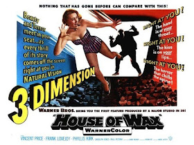
Poster for House of Wax (1953) movie in 3-D

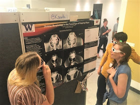
This week, I have a guest post from Kayla Hall, who created this poster. Click to enlarge!

Poster for "Diverse morhology in the forewings of flapping rays"

I reached out to Kayla because all of her central images are in 3-D!

These images can be viewed in 3-D using the red-green glasses, which is the same technique that was used by filmmakers in the 1950s for movies like House of Wax and Creature from the Black Lagoon. Even Alfred Hitchock made a 3-D movie: Dial “M” for Murder. Interest in 3-D movies was high for a few years, then petered out.

This red/green 3-D image is technically called an anaglyph. I’ve seen this technique used rarely, but consistently, at poster sessions through the years, but never had reason to make one myself. I wanted to know how it was done.

First of all, why? Kayla wrote (lightly edited):

I had a few reasons for choosing to display these specimens in 3-D:

Firstly, our previous publication characterized a skeletal structure in the fins of one family of stingrays, but that project solely used 2-D radiography. This was the first time we’ve been able to see this morphology in 3-D space and quantify all of the other aspects, such as thickness and curvature depth (for muscle attachment) of the primary cartilages across families.

Second, most of my work has used specimens from museum collections. Computerized tomography (CT) scanning allows us to gather all of the anatomical and morphological information without destructively sampling rare specimens. In fact, two of the stingrays displayed on the poster are actually new species to us, not previously included in our publication, so this was a first for visualizing and characterizing their anatomy. Scanning and viewing the Myliobatis specimen (#1) in 3-D space allowed us to add this new species to the list of individuals that lack the pectoral fin framework, as this is the only genus to exhibit variation in the presence/absence of this trait across species.

So that’s the why, but what about the how?

We used the Bruker micro-CT scanner, reconstructed the CT images using the program NRecon, and finally visualized the reconstruction in CTVox. CTVox is also the program I used to generate the 3-D images. They have a “Stereo viewing” button that converts the reconstruction into a 3-D image viewable with standard red-blue glasses.

You are not able to tweak the red-blue hues, but you can always toggle with the original histogram settings that produce the 3-D reconstruction to alter the color contrast.

I bought a multi-pack of basic red and blue glasses from an online retailer. (Search “anaglyph 3-D glasses” or just “3-D glasses.”- ZF)

Printing on matte paper works best for visualizing the 3-D work.

Easy once you know how!

And here Kayla shows off her results to Kelsi Rutledge and Jules Chabain.

Kayla Hall showing her poster to Kelsi Rutledge and Jules Chabain, all wearing 3-D glasses

You can produce the 3-D effect with just a high-quality graphic editor. In brief:

  1. Get two images. You either need to take or find two pictures from slightly different viewpoints, or you need to edit an image to mimic the effect.
  2. Merge the photos.
  3. Remove the red from one image.
  4. Remove green and/or blue from one image.
  5. Crop the edges where they don’t overlap.

If you do this to a single image, however, you are creating an illusion. It isn’t “real data” in the sense that am image generated using a CT scan or two actual photographs. Be sure to label images with appropriate disclaimers!

External links

Diverse morphology in the forewings of flapping rays
How To Create Anaglyph 3D Images That Really Work!
How To Make Classic Red/Cyan 3D Photos Out of Any Image

03 October 2019

Critique: Agricultural landscapes

Aleksandra Dolezal will testify that Neil Gaiman’s law of typos, originally applied to books, also applies to conference posters. It doesn’t matter how closely you check, you will find a mistake as soon as the thing is printed and you can’t fix it.

Double, triple checked my poster PDF before printing and after it was done I found a small alignment mistake. Damn you brain for not seeing it earlier ๐Ÿง !! Oh well what’s done is done. I like the colours so still happy ๐Ÿค—

Click to enlarge!


Before it went up, Hannah Brazeau said,

This very well may be the most beautifully designed poster I’ve seen. Amazing.

Hannah was not alone in her opinion. This poster won the award at the joint meeting of The Canadian Society for Ecology & Evolution, the Entomological Society of Canada, and the Acadian Entomological Society (or EcoEvoEnto2019 for short)! And the competition was fierce.

Aleksandra collaborated with her sister to achieve the distinct look of the poster (lightly edited from email).

Me and my sister, Amelia Dolezal, came up with this idea together. She helped make the flowers and icons. She was more of the fancy design guru whereas I was the logical researcher fitting in the blanks.

I’m pleased to give Amelia more visibility for her work on this poster, since her name was not on the original poster. Amelia has some graphic skills that she is putting into work as a tattoo artist.

This poster is a legitimate work of art.

The whole poster was drawn by using a tablet with Photoshop cs6, using a several different brushes. And all that text? That isn’t a font. The entire thing is hand lettered by Aleksandra. She wrote:

This was done with hand lettering in my own handwriting. I wanted it to be as personal as possible. I wanted it to look like my field notes and lab bench.

My only comment on the graphics is that I might like a tiny bit more contrast and/or brightness in some colours. When shrunk down (like for the preview on this blog), some of the text and images fade away. But when expanded to full size (three feet wide by four feet tall), I could see everything fine, so this is a very minor problem.

On her own blog, Aleksandra describes some of the creation of the poster, focusing more on the conceptual side of things rather than the nitty-gritty details. I particularly like this:

I have around 6 analyses in my these project that all have awesome, cool results but for this poster I decided on focusing on 3 that I think really put out the message I wanted.

It’s easy to look at the tasty visuals and conclude that’s why it’s successful, but Aleksandra clearly did the hard editorial work deciding what to include and what to cut.

External links

My advice for creating an academic poster on Aleksandra’s blog

26 September 2019

Link round-up for September 2019

Cody Christopherson asked students on Twitter:

Which is the worst outcome when you present a poster at a research conference?

The sample size was 944 votes, but Cody included a “Show me results!” option which I have removed in the table below.

FatePercentVotes
Ignored64.7%415
Not being told about serious problems21.8% 142
Criticized to my face 14.4% 94

I am surprised that being ignored won students’ “worst outcome.” I wonder if this is because it may be the most common bad outcome, since many people have reported having no visitors to their poster at least once.

I was also surprised that getting criticized directly was the last choice. The only time I have gotten in trouble on the blog was from PIs who didn’t want their students to be criticized, because they thought it would be too soul-crushing to students. Hey, PIs: maybe your students are tougher than you think.

Hat tip to Dorothy Bishop.

• • • • •

Drew Steen has an entire Twitter thread of “bad on purpose” charts and graphs produced by his students. This one was voted the worst:


Hat tip to Holly Bik.

• • • • •

Now compare the “bad on purpose” plots in the thread above to the sincerely intentioned graphs collected by Jessica Tierney. Jessice has a great thread on the horrors of data visualization, using International Panel on Climate Change graphics. It introduced me to a term I hadn’t heard before: the “carpet plot.” An example is below. It almost has a Christmas-y feel.


I feel like we need a community conversation about visual communication. ... Ask yourself: 1) Do you need all that stuff? 2) Is this cognitively accessible? 3) Is this colorblind friendly? 4) #endrainbow 5) #endneon. If you wouldn’t decorate your living room with that color - why would you use it in a scientific plot (?)

Hat tip to Jarrett Byrnes.

• • • • •

Morgan Simon’s article is titled, “How to be a young woman (or anything other than a grey-haired white man) at a business conference and still get shit done,” but you could probably strike out “business” and replace it with “academic” and a lot of the advice would still apply.

  1. Have an objective.
  2. Your title doesn’t define you.
  3. Watch out for references that make people focus on your age, instead of your abilities.
  4. You already look different — so just be different.
  5. Learn how to make friends — not just network.
  6. Know when to hold them… and when to fold them.
  7. Build new centers of gravity.
My favourite, by a long way, is #5. I think section #4, which includes thoughts on dressing for conferences, may interest many women readers, who often struggle to find a conference wardrobe they are happy with. Hat tip to Nina Simon.

• • • • •

I forgot to add this 3-D poster from a couple of months back.


Pictures by Nicole Ackermans. A “how to” post is waiting in the wings!

• • • • •

I think this is a first on the link round-up: an Instagram thread on posters! This come courtesy of Keighley Reisenauer. Here’s the first pic to get you started:


• • • • •

Kelsi Rutledge shows the benefits of working with professionals. To publicize her description of a new guitarfish species, she had a professional photographer get some fantastic images:

Kelsi Rutledge on beach with guitarfish

Not a poster, but I don’t care.

• • • • •

Back-to-back bookend podcasts! The BOOM (Biomechanics On Our Minds) podcast starts with navigating the conference experience.

The conference conversation continues on the Doctor You podcast, including best and worst conference experiences.

Hat tip to David Shiffman.

• • • • •

A reminder from Laura Bergalls:
“Don’t center long blocks of text.”

I’ve had to address this twice last week - with 2 different clients.

I might write a 500-1000 word article, and they’ll center justify the whole thing, making it extremely difficult to read.

PS - I hope this isn't some kind of new and kooky design trend. If so, it needs to fade, fast.

If you want to center a title or a caption, fine. But there’s a reason your newspaper left-justifies articles.

Readability. Accessibility.

Let’s nip this wannabe trend in the bud.

• • • • •

What do you do with all your conference lanyards? Anne Carpenter wants to know.

What’s the most fun reuse you’ve found for conference lanyards?

My daughters use them as leashes for their stuffed animals.

Hat tip to Justin Kiggins.

• • • • •

Pineapples and Whales have created A scientist’s guide to making presentations. Some of the advice applies to posters, too!

• • • • •

Roberto Keller has a nice Twitter thread showing how scientific figures used to be made.


Lines are inked using a ruling pen. Text is machine-printed, cut out, and glued. The curved dash line is glued into shape from a thin straight strip previously inked. This job was usually done by a professional who was a staff illustrator at the university.

Aren’t you glad you live in the future, where you don’t have to go through this rigamarole? Hat tip to Milton Tan.

• • • • •

And let’s end the month on a positive note from Melody Waring:

I’ve witnessed a beautiful academic moment. A senior academic asked my neighbor if she’s presenting. A grad student, she glanced down and said, “No, I just have a poster.” He leaned forward, warmly, sharing how critical posters have been to his work. Not “Just,” he says.

19 September 2019

Networking flair: Reasons to wear something ridiculous at a conference

Jessica “Rocky” Rohde presents a great networking tip from her Instagram account (lightly edited).

Three reasons you should wear a ridiculous hat like this at your next conference.⁣⁣⁣⁣


This is my cruising hat. Originally, it was for a Halloween costume (Hunter S. Thompson, Fear and Loathing in Las Vegas ๐Ÿ˜œ).


But I wore it every single day of a conference on a cruise ship.⁣⁣⁣⁣⁣⁣⁣ Wearing this “piece of flair” is actually a strategy for meeting people and networking.⁣⁣⁣
⁣⁣
It makes you recognizable

After taking the stage to speak about my work helping scientists become better public speakers, I ended my talk with, “If anybody wants to nerd out about science, tech and engineering, just look for the green hat.” Then I flipped it Justin Timberlake style onto my noggin. ⁣⁣⁣Throughout the rest of the cruise, people would come up to me and say “Oh, you’re the green hat girl!”

⁣⁣It makes you approachable

At a conference when you meet a new person every few minutes, you become exhausted of explaining where you are from and what you do over and over. Wearing something unusual gives us something unexpected to talk about.⁣⁣⁣⁣⁣⁣⁣
⁣⁣
Them: “What’s with the hat?” ⁣⁣⁣⁣⁣⁣⁣
Me: “This is part of the uniform. I’m a cruise marshal. Don’t tell anyone, though!”⁣⁣⁣⁣⁣⁣⁣
⁣⁣
It tells people something about you

I’m a little bit silly (understatement of the year ๐Ÿ™ƒ) and people know before I even open my mouth that I’m, well, a little different.⁣⁣⁣⁣
⁣⁣
Your “flair” doesn't have to be a hat. Space pants work great, too. ๐Ÿ˜ If you want to be a little more subtle, it can be an interesting shirt, tie, jewelry, or a pin. A colleague of mine wears his conference badge on Mardi Gras bead necklaces!⁣⁣⁣⁣⁣⁣⁣⁣⁣

I have done similar things to Rocky. I’ve worn a kilt at conferences. I’ve had blue hair at conferences. And it works as a conversation starter. A distinctive piece of clothing, just like a poster, can act as a social object.

But Charles Cong Xu went next level when he presented a poster about spider web DNA at the recent joint meeting of The Canadian Society for Ecology & Evolution, the Entomological Society of Canada, and the Acadian Entomological Society (EcoEvoEnto2019) meeting.


This, my friends, is committing to your theme. And you better believe there were a lot of pictures of Charles if you were following the conference hashtag. I reached out to Charles and asked about the experience.

“Go big or go home” was why I decided to dress up and have some fun with it. The socks and compression shirt worked well, but the mask was stuffy. I ended up just putting it on every once in a while when people wanted to take photos.

I did not get any pushback about the costume, at least none that I’m aware of. On the contrary, the poster and costume drew a lot of positive attention at the conference as Twitter would testify. ... I think it’s a good sign when people want to take selfies with you and your poster.

(I will have another post focusing on Charles’s poster soon!)

This clearly worked for Charles, but not everyone will have the nerve for full blown cosplay.

Even if you want do something this full on, you have to know the conference and know the crowd to figure out if you can pull it off without damaging yourself professionally. Navigating a conference as a professional means blending in to some degree. And while many academics claim not to care what a poster presenter looks like, they can be judgey about it.

Do you wear something that people always comment on?

External links

Rocky Rohde

Related posts

Conversation piece

EcoEvoEnto photo by Canadian Society for Ecology & Evolution twitter account 

12 September 2019

Freedom to change from your abstract


Jennifer Rohn asked:

Academic STEM Twitter: how far have you ever strayed from your submitted abstract when it comes time to write the talk or create the poster? Or turn it around: if you went to a talk/poster and the presenter included extra information/some tangents, would this bother you?

For me, the real question is not whether people can or should change or add content, but why it happens so rarely.

In the world of academic conferences, abstracts are usually written months in advance. 

  • The Society for Integrative and Comparative Biology abstract deadline was 4 September, and the meeting will be held 3 January, which is four months away.
  • The Society for Neuroscience abstract deadline was 3 May, and the meeting starts 19 October. That’s five months out.
  • The American Geophysical Union abstract deadline was 31 July for a 9 December meeting. Also five months out.

With that much time between when the abstract is submitted, it should be no surprise that you may have learned a few things since the abstract was submitted. You may have collected new data. You may have completed an analysis. You may have changed your mind.

Because there are no poster police, there is no reason to limit yourself to what was on the abstract. 

The only thing that I can see a small reason for keeping the same is the title. People who are looking for a poster with a particular title might be confused if the title bore no resemblance to the original. But if the deep structure of the topic is the same, reworking the title should be okay.

Change whatever you need.