Grids are a cinch
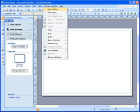
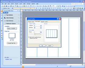
Grids are at the heart of successful poster design. Under “Arrange,” pick “Layout guides,” then pick the “Grid guides” tab.

From there, all you have to do is pick the number of columns you want to have, and the space between them. And you’ve now got an evenly spaced grid!

Setting up grid guidelines in other programs is rarely this painless. You usually have to do a lot of calculating to set up each individual guideline.
You can also set up rows in the same way. This is not as useful as often in posters, which are usually dominated by vertical divisions, rather than horizontal (apart from the title).
Once you’ve got columns, draw a single text box in each one and paste in your text. Because posters usually have many graphics, you’ll want to insert pictures, too. This is where another feature of Publisher comes in handy.
Text wraps around pictures
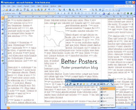
Many other programs either cannot wrap text automatically (like PowerPoint) or make you jump through hoops to get there. When you insert a picture into Publisher, the text will normally flow around it. If the picture is the same width as the column, the text will break and continue below it.

The default spacing is not particularly graceful, so it is worth fiddling with the settings after the picture is in so that the text isn’t too close to the picture.
Joining text across columns
Many people, particularly those working with PowerPoint, create their posters as a zillions small text boxes that almost invariably go out of alignment because there are so many of them, and they are all different widths. Publisher allows you to link text boxes into one continuous piece of text.
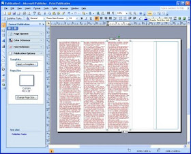
Click on a text box. If there is more text than will fit in the space, it will show an “overflow” symbol at the bottom. On the menu bar, there is a “Create Text Box Link” button. Click it, then bring the mouse down to the next column. The mouse icon will change to a bucket. Click it within the box to “pour” the overflowing text into the next column.

Continue this for each column. Once this is done, the text will automatically rescale through all the text boxes. For example, if you add a picture to text box one that displaces some of the text, the text will shift down automatically, through to the last linked text box. The same thing will also happen if you enlarge or reduce the text.

No comments:
Post a Comment
Comments are moderated. Real names and pseudonyms are welcome. Anonymous comments are not and will be removed.