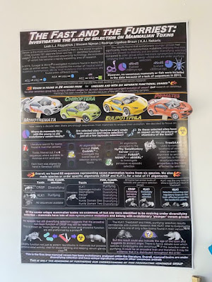
A well executed poster in comics style:
Poster by Roger Ort. Hat tip to Antonia Hadjimichael.
• • • • •
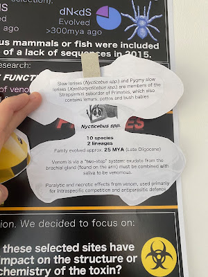
Pop culture reference? Hmm...
Wait, interactive papercraft?
Well...
Work by Fitzy. She nailed one of the advantages of having this kind of interactive element on a poster:
it was great in nabbing people to come closer and chat lmao
Hat Tip to Catherine Scott.
• • • • •
Conferences should be for everyone! To help make that real, here is a “Toolkit to Design More Accessible Scientific Meetings and Conferences” (link opens PDF). Here are a couple of pieces of advice related to posters:
Information To Share Prior To The Conference: Map of exhibit hall and where poster sessions are located, along with a written description of this information.
Exhibit halls and poster sessions: When possible, provide several feet between posters to allow participants to hear what is being said by the presenter.
During your presentation: If presenting a poster or visiting a poster, initiate the conversation by identifying yourself by name.
I am very glad to see the second point. Conference organizers are tending to make posters smaller so they don’t have to pay for bigger spaces. Small posters are an accessibility issue!
• • • • •
Here’s a 23 minute recording of an online workshop for poster making! This is coming from Embry-Riddle Aeronautical University.
Faulconer E, Deters R, Terwilliger B, Rister A, Velez M. 2023. Research scholars workshop: Research posters that engage. https://doi.org/10.5281/zenodo.7756874
• • • • •
A short book chapter that I hadn’t seen before:
Thakur AJ. 2022. Posters for medical & scientific meetings. In: Tapping the Power of PowerPoint for Medical Posters and Presentations, pp. 119-134. Singapore: Springer Nature Singapore.
Most of the basic suggestions about poster design are there, but I wish the text and illustrations were more polished. For instance, there are multiple quotes attributed to “Anonymous”, but no source is given in the references.
• • • • •
Thanks for joining me this month!


No comments:
Post a Comment
Comments are moderated. Real names and pseudonyms are welcome. Anonymous comments are not and will be removed.