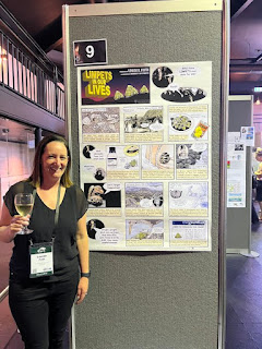
This week’s contribution comes from Louise Firth. It was presented at the International Tidal Reef Symposium (#ITRS2023) in January. Click to enlarge!
I am a big fan of using the techniques of comics on academic posters. So when I spotted this comic-inspired poster (hat tip to J. E. Byrnes), I wanted to share it here on the blog.
Usually, posters are the first drafts of papers. But in this case, the poster arose out of a review paper that Louise wrote at the start of the pandemic.
The paper was my “Lock down project,” because I, like everyone else was struggling with work and this was a fun way to make me enjoy doing work in a bubble. As the paper was so long, I figured no one would read it so the poster was my way of summarising it and advertising it.
She also used the artwork in this poster in a summary of her limpet review paper on Twitter. I think this is another advantage of the comics format: it can be often broken apart into individual, sharable pieces for things like a Twitter thread.
Things that work on this poster:
The title. It reminds me of how many Sunday comic strips were laid out. The title of the strip would take up a good chunk of the upper left corner, and the action would usually start in the upper right corner.
Here’s an example from Dick Tracy, circa 1938:
A later example from Peanuts:
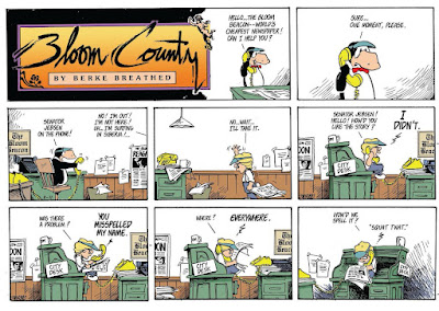
And an even later example from Bloom County:
That layout of the title very much enhances the comic feel of the poster.
The art. I think a lot of this was originally from a variety of sources, but I suspect that Louise did a little editing to harmonize the style of the artwork on most of the poster. The exception is the title, which stands out because of its dark background on a poster where most of the panels have a white background.
What works less well?
The lettering. Yup, it’s our friend Comic Sans, whose shortcomings have appeared in this blog many times before. If this used a professional level comic font like something from Comicraft or Blambot, it would just elevate the whole poster.
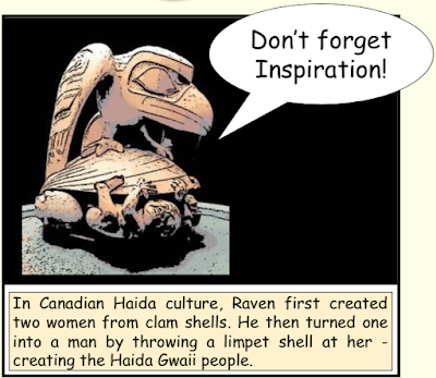
Here’s one original panel (snitched from the Twitter thread):
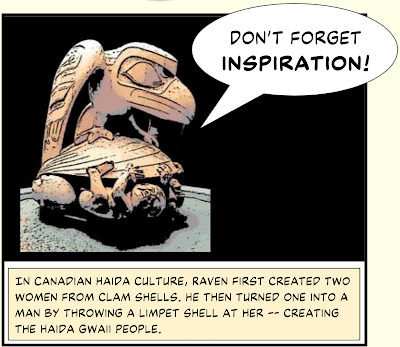
Here’s the panel using Ready for Anything, an outstanding general comic font from BlamBot:
And here is something a little more ambitious: using different type for the spoken words (Back Issues) and the captions (Manly Men).
Thought I like these revisions, I can’t so another element easily change...
 The word balloons. These balloons are highly characteristic of
Microsoft PowerPoint. Professional balloons in comics have pointers that are thinner and curved, and the proportions of the ovals are different. I didn’t think there was a simple solution
at first, but then I found that Comicraft has word balloons for sale in Illustrator EPS format for a very reasonable price.
The word balloons. These balloons are highly characteristic of
Microsoft PowerPoint. Professional balloons in comics have pointers that are thinner and curved, and the proportions of the ovals are different. I didn’t think there was a simple solution
at first, but then I found that Comicraft has word balloons for sale in Illustrator EPS format for a very reasonable price.Blambot has word balloons for sale, too.
Blambot’s balloons are Adobe Illustrator paintbrushes, so maybe not quite as readily portable into other graphics packages.
Are these issues just me scratching my comic book nerd itch? Yeah, probably a little. But I think if you are going to use a form, it is worth leaning into it. The lettering, in particular, would not be hard to change. It would costs just a few bucks to buy a font, a few minutes to install it, and a few more minutes to change the text in the poster.
Thanks to Louise for being this week’s contributor!
Reference
Firth L. 2021.What have limpets ever done for us?: On the past and present provisioning and cultural services of limpets International Review of Environmental History 7(2): 5-45 https://search.informit.org/doi/abs/10.3316/informit.190553729493929


No comments:
Post a Comment
Comments are moderated. Real names and pseudonyms are welcome. Anonymous comments are not and will be removed.