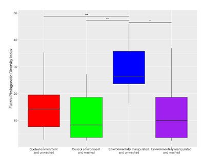
This is a figure in a journal.
This is simple data that is much harder to interpret than it needs to be.
At a glance, it looks like it’s showing one variable with four groups. But it isn’t. To get that, you have to read each of the four labels on the horizontal axis very carefully.
Then you realize that the graph is showing two variables. It’s a 2⨉2 experimental design. One variable is environment and one variable is washing.
To make the relevant comparisons, I have to keep checking the axis label, because there is no other clue as to which box pairs with any box.
Significant differences are shown by three lines with asterisks above them. But the differences can be summarized in one statement: “Third from the left is higher than all the others.”
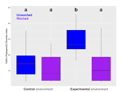
Here’s a quick and dirty graph makeover. As is so often the case, problems are solved by making things simpler.
First, I reduced the axis labels from four to two, one for each “environment.” Fewer labels also means larger labels, both of which make the axis easier to read. It more clearly shows what the adjacent boxes are comparing.
Second, I reduced the number of colours from four to two, one for each “wash” condition. This more clearly shows which non-adjacent boxes should be compared. (The colour and legend could be better. Remember, this is a quick makeover.)
Third, I swapped the lines for letters. The rule is, “groups with the same letter don’t differ.” This does lose a little information. The original has some comparisons with three asterisks, some with two, which usually indicates different p values. But that level of detail can be put in the text if it’s that important. It usually is not.
(Aside: The graphing program OriginLab has “paired comparisons” as a built in option.)
The design principles at play in this makeover?
First, be cautious of templates. The original graph looks like someone just used the default settings in a graphing program. (R studio, maybe ggplot2?)
Second, simplify.
Third, make related things similar. Usually, I say, “Keep related things together”, referring to similar positions in space. That is in play here with the axis labels. But related things are also shown by other similarities: colour, shape, and so on.


No comments:
Post a Comment
Comments are moderated. Real names and pseudonyms are welcome. Anonymous comments are not and will be removed.