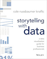
Some scientists might pass over Storytelling With Data (2015) because they have an incredible aversion to the word “storytelling.” Author Cole Nussbaumer Knaflic might drive off some people when she writes things like, “The magic of story.” It can sound a little hippy dippy trippy sometimes.
If “story” and “storytelling” freak you out, let me make a pitch for this book and give you another way to look at it.
Most of the book is about annotated data visualization. Fully seven of the book’s ten chapters are devoted to picking apart and recreating graphs.
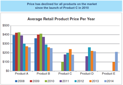
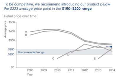
For example, Knaflic takes a mundane bar graph like this: And shows the process to get to this:Same data set. But one has a much clearer focus on what information is critical to the viewer.
I sometimes do similar things with graphs here on the blog, and some of the principles will be familiar to readers of the Better Posters book. But this book drills down into making a single graph in a much deeper way, with many more examples.
How to take a single graph from an Excel default and into something more targeted and informative has been on my mind a lot lately, and this book is the best I have found on the subject so far. Recommended.
Related posts
External links


No comments:
Post a Comment
Comments are moderated. Real names and pseudonyms are welcome. Anonymous comments are not and will be removed.