“How do I turn this on?”
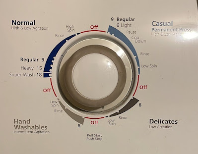
I was visiting, trying to use the washing machine, and was confronted with this.
When you want to turn on something with a knob, you look for something around the dial that “Start” or “On,” right? Nope.
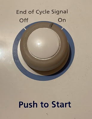
But maybe this was more a button, and when you want to turn on something with a button, you press it, right? Nope.
I couldn’t get the washer to start. I literally gave up on fiddling with the machine. Instead, I:
- Opened my phone
- Typed in the maker and model of the washing machine
- Found an owner’s manual online
- Downloaded the PDF of the manual
- Skimmed through the first few pages until I found the instructions to turn on the machine.
No joke. And I did all this even though the answer was staring me in the face.
If you look at the button above, you will see the instructions to turn it on. And there’s the first problem.
“Pull start.”
You mean, the complete 180° opposite of the usual thing that people do to turn on machines? Maybe something that runs so counter the norm is important!
Lesson #1: Warn people – loudly – if something works differently than the way most other things work, warn people. Not in a whisper.
But even putting that aside, why could I not see the instructions that were helpfully right by the button? There’s the second problem. The instructions are in fine print, surrounded by a lot of other information about four other wash cycles, at the bottom.
Lesson #2: More information can make a task harder, not easier.
This washer button reminded me of so many conference posters I have seen over the years. Things are not in places readers expect them to be. There is so much information and so little emphasis that readers are struggling to find what they want.
My case was unusual, because I was using this machine for the first time. You do expect the same person to be using a home appliance over and over again. The “fine print” instructions are normally only going to serve as a reminder.
But I had no problem turning on the dryer.
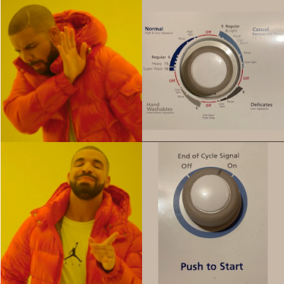
Less information, and what is present gets some emphasis using size, bolding, and colour.
This is more like what a conference poster should aspire to be.
A shorter version of this originally appeared as a Twitter thread.


No comments:
Post a Comment
Comments are moderated. Real names and pseudonyms are welcome. Anonymous comments are not and will be removed.