When he write there are only three basic shapes (circle, square, triangle), you can tell he has cut way back on complexity to try finding the core principles behind visual storytelling.
Sure, some of the book deals with things like camera movements, but there is still lots here that applies to posters.
Block lists seven visual elements.
- Space
- Line
- Shape
- Tone
- Colour
- Movement
- Rhythm
For the purposes of posters, “movement” rarely comes into play, since we are typically dealing with a static document.
The remaining six elements – with one exception – may be familiar to readers of this blog. The chapter on colour, for instance, has a lot of parallels to the chapter on colour in my own book.
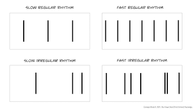
The one element that sounds weird to apply to a static image is rhythm.
Think of rhythm as how often something changes as you look across an image.
Most conference posters have a high visual rhythm, and often an irregular one. Conference sessions, even more so, because you scan from poster to poster, each of which alone has a high rhythm. With the cumulative effect, it’s not surprising that poster sessions are tiring.Block points out that all seven of these visual elements vary. Using colour as an example, red, pink, and orange are more similar to each other (which Black calls “affinity”), and blue is very different. Blue is a contrasting colour to the others.
To go back to the list of visual components, the contrasting “end points” might be:
- Space: Deep versus flat
- Line: Horizontals versus diagonals
- Shape: Circles versus triangles
- Tone: Dark versus light
- Colour: Hue and saturation
- Movement: Vertical versus horizontal
- Rhythm: Slow versus fast
From there, Block notes that elements that are the most different – that is, have a high contrast with each other – are the most visually intense.
Contrast increases visual intensity, but affinity decreases visual intensity.
And changing that level of visual intensity can be used to support a visual story, like a movie. On a poster, I’ve written before about how contrast can be used to draw attention to things, which is a variation on Block’s idea. Visually intense things hold our attention.
Despite the depth Block brings to this subject, the book is a relatively quick read. Block uses tons of examples from movie still frames, which are quick to grasp and make his points easy to understand.
For most conference poster makers, you might not need a copy on your shelf. But it is worth checking out a copy of this book from a library.
Reference
Block B. 2021. The Visual Story Creating the Visual Structure of Film, TV, and Digital Media (Third Edition). Routledge: New York. https://www.routledge.com/The-Visual-Story-Creating-the-Visual-Structure-of-Film-TV-and-Digital/Block/p/book/9781138014152
External links
ABT Time Episode 17: USC film professor Bruce Block and Directors Jason Ensler and Greg Tillman


No comments:
Post a Comment
Comments are moderated. Real names and pseudonyms are welcome. Anonymous comments are not and will be removed.