One of the most powerful ideas in statistics is that you can summarize an indefinite amount of data with just a couple of numbers. For example, a mean and standard deviation can tell you a lot about millions or data points.
For that reason, I’ve always had mixed feelings about the saying, “Friends don’t let friends use bar graphs.” The argument is that you should always plot all the data points because summary statistics can be misleading if the data have unusual distributions. This seemed to me to be throwing away one of the central ideas of statistics. In the Better Posters book, I argued that showing a summary bar graph is fine if the underlying data meet normal assumptions.
I am having second thought on that because of a paper by Kerns and Wilmer (2021) about how people read bar graphs.
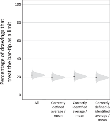
Bar graphs can show at least two things: quantities or averages. Kerns and Wilmer are concerned with averages. They show that about one in five people (20%) misunderstand what a bar graph is showing. They treat the end of the bar as the upper limit of a range, not a mean.
Kerns and Wilmer call this the bar-tip limit error.
They found this by showing people bar graphs and asking them to place imaginary data points on the graph.
“But,” you might say, “is this just a mistake people make because they don’t understand averages?”
Nope.
Kerns and Wilmer show that even when people can define what an average is (second from left in graph above)...
And even when people can identify the average on the graph (third from left above)...
And even when people can do both (rightmost in graph above)...
About 20% of people still make the mistake of placing all the data points below the bar tip.
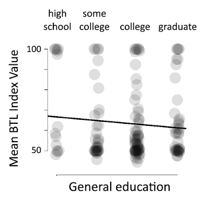
“But,” you might say, “maybe people with more advanced training would not make this mistake? At an academic conference, most of the people are in or have gone to graduate school.”
Nope – well, mostly nope. General education alone doesn’t seem to make much difference, but specific education might.
In the graph above, high values near 100 show a subject made bar-tip limit error. All four groups show a persistent minority – again, about one in five – make the bar-tip limit error.
But lest you think this is some sort of “hard wired” cognitive bias for some people, mistakes do seem to decline as people received more formal training in statistics.
Nevertheless, even with multiple courses in statistics, some people continue to make the bar-tip limit error.
This might explain why there are so many people who continually complain about “Half the country is below average!” Hat tip to Darach Ó Séaghdha on Twitter for spotting this example:It is worth creating bar graphs with the knowledge that some people won’t read the graph correctly.
Twenty percent is a lot of viewers. For comparison, think about the
attention designing for colour blindness gets, even though probably less
than 5% of people at a typical conference are colour blind.
On a poster, I worry about the level of visual complexity inherent in graphs where the major point is to show differences in averages. I say again: summarizing data is powerful. But I see the value in helping readers avoid falling into the bar-tip limit error.
I suggest that your bar graphs of averages use colour to emphasize the bar, so that it is visible at a distance, and use low contrast to show the individual data points. (See this post on putting make-up on your graphs.)
This is the scenario tested by Kerns and Wilmer:
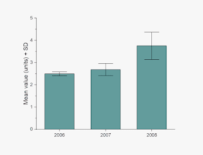
As far as I can tell, Kerns and Wilmer did not test the effect of adding any sort of error bars to the graph, like standard deviation or confidence interval. So maybe that would help avoid the error:
But maybe the best way to break the bar-tip limit error is just to add the data.
But this is now getting visually complex. The colours used to fill the bar above are a little intense. Large areas of colour still read as a colour, so those are a bit more subdued.
References
Kerns SH, Wilmer JB. 2021. Two graphs walk into a bar: Readout-based measurement reveals the Bar-Tip Limit error, a common, categorical misinterpretation of mean bar graphs. Journal of Vision 21(12): 17. https://doi.org/10.1167/jov.21.12.17
Related posts
Never use a graph you can’t explain
External links


I always thought that bar plots are misleading because, even when they refer to a normally distributed measurement, they are an asymmetric representation of a symmetric distribution - this is intrinsically problematic.
ReplyDelete