How many visitors can you expect to your poster in a virtual conference? This paper suggests about 10.
Six hundred ninety electronic posters (ePosters) were visited by over 7,000 unique visitors. Each poster was viewed on average by 10 ‘visitors’. Visitor number per poster concentrated in the range between 6–20: 344 posters received 6–10 visitors and 244 posters were viewed by 11–20 visitors. Posters across the tracks received quite even attention with the exception of Track 9, which was for student ePoster competition and increased visits from judges(.)
It’s not clear how generalizable that number is. This analysis is from exactly one conference with a little under 2,000 attendees. The authors do note, however, that any number is better than an in person conference, where organizers have zero knowledge about what posters and sessions were popular.
• • • • •
A paper on creating an inclusive online poster session.
(O)ur survey data indicate that 70% of 198 survey respondents attended the virtual poster session. Of these respondents that attended the session, 100 attended as viewers only (72%), 7 as presenters only (5%), and 32 as both viewers and presenters (23%). Most survey respondents (96% of viewers and 77% of presenters) indicated that their experience either met or exceeded their expectations. While in-person poster sessions were still preferred (slightly or strongly) by both attendees (45%) and presenters (54%), surprisingly, some attendees and presenters (23%) enjoyed virtual sessions and in-person sessions equally. Furthermore, 32% of respondents who viewed posters and 23% of respondents who presented posters expressed either a strong or slight preference for virtual poster sessions.
Their tips:
- Use combined asynchronous and synchronous sessions
- Use short video or audio introductions
- Use Zoom features that allow attendees to enter and exit breakout rooms for synchronous sessions
- Use video and live demonstrations on how to use the different poster platforms
- Expand poster submission timeline to enable organizers to share virtual poster sessions with conference attendees earlier
- Have a smaller number of posters per session or topic room
- Incorporate volunteer attendees and topic-based virtual synchronous sessions
- Provide online etiquette guidelines
• • • • •
What drives changes in the “look” of graphics? The article, “DALL·E 2 and The Origin of Vibe Shifts”, argues that for websites, great photos suddenly became easy to get... and were promptly abandoned, because they no longer signaled “high end.”
• • • • •
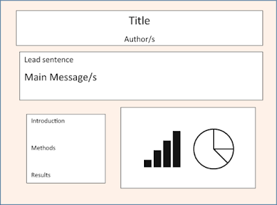
The new book A Roadmap to Successful Scientific Publishing has one section of one chapter about conference posters. I can’t say that the illustration of a poster “sketch” fills me with confidence:
I understand this isn’t meant to be a fully formed poster, but it wouldn’t have been difficult to at least align the sections.The text is a little better. It does emphasize simplicity, but promotes things like a “lead sentence” under the title to grad attention (can’t that just be... the title?) and bulleted lists.


No comments:
Post a Comment
Comments are moderated. Real names and pseudonyms are welcome. Anonymous comments are not and will be removed.