Antonia Hadjimichael has a blog post, “Five tips for creating visually appealing scientific posters.” It contains some material familiar to readers of the blog. It is always great to see ideas spread!
• • • • •
The question of whether there can be rules to design, including data visualizations, is a vexed one. This thoughtful blog post suggests that there are come helpful steps you can use to help land on a good graph.
I think that many common dataviz design decisions can be codified as formal rules that can be followed by practitioners of any experience level to make the best possible design choice in any situation, without exception. The bad news is that these rules can’t be captured in simple “always/never” sentences... . The good news is that many of them can be captured in relatively simple decision trees.
• • • • •
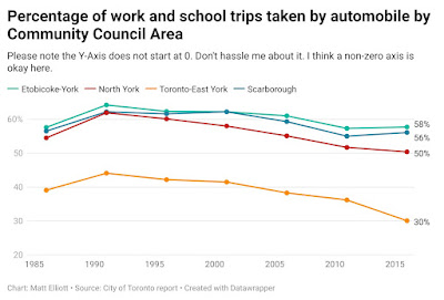
Matt Elliot anticipates and solves problems before anyone anyone can make something of it.
Best. Graph. Subtitle. Ever.
Hat tip to Michael Hoffman.
• • • • •
Nuria Melisa Morales García has a Twitter thread about graphical abstracts. Much of which applies to posters.


I read your blog you have a good writing skills you done your job tremendously i love to read it and you provide information in very decent manner. We also provide Flooring services in Pert. We have excellent team of experts worker they do there work in a very decent manner. They make your old dual floor in to a shine floor. Build your Dream home with us. Please Do visit your Website HH Floor sanding Perth for best services and competitive prices
ReplyDeletefloor sanding company
polished flooring perth
timber floor sanding perth
dust free floor sanding perth