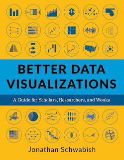
Once I finished smiling at the “separated at birth” similarities, I realized I should actually read Jon’s book because it was, as they say, “relevant to my interests.”
Better Data Visualizations is very useful.
The bulk of the book is a big ol’ list of different graph types. The charts range from the common (bar charts, scatter plots, and tables) to the more esoteric (Voronoi diagrams, Marimekko charts). It’s not quite an “encyclopedia of charts,” but it is thorough.
There are usually multiple illustrations (in full colour) of each type of chart so you can see them “in action,” as it were. Almost all the illustrations are in full colour.
Every entry has a series of tips of how to avoid pitfalls and maximize the effectiveness of that particular chart type. I particularly appreciated the concise guidelines for making tables presentable.
Readers of this blog who work in the humanities occasionally ask about techniques for their fields. If that is an interest of yours, you’ll be pleased to know Schwabish has a section on qualitative visualizations. It is slimmer than the section on quantitative visualizations, but given that this is an area that is often ignored completely, this is an extremely welcome addition to this book.
There is a section showing “before and after” revisions of charts that is quite fun.
Lastly, there is a section on developing a style guide. While this is aimed at organizations that make a lot of charts, I realized that it could be extremely helpful for a poster maker to draw up a short style guide for their poster. One of the biggest problems I see on posters is inconsistency. This is usually because people use different software tools for different parts of the poster, and they don’t check to harmonize the graphs and the rest of the poster.
While I was reading, I was wondering, “But how could someone know how to make some of these non-standard charts?” While the appendices are often considered to be extra material that can be removed, the appendix on data visualization tools was extremely helpful for me. (“Microsoft has a graphing site called Charticulator? Cool.”)
Because data visualizations are often the heart of conference posters, there is definitely some overlap in Jon’s book and mine. But Better Data Visualization covers much more territory there than mine does.
External links
Related posts
Solving the Pokemon problem for posters


No comments:
Post a Comment
Comments are moderated. Real names and pseudonyms are welcome. Anonymous comments are not and will be removed.