Recently, I talked about how data sets like this are very hard to turn into posters:
Projects like this are usually better as a slide talk, where each panel can be on an individual slide.
But you don’t always get your preferred presentation slot. There are just not enough slide talks to go around in many conferences.
As solution is to figure out which data are the most important, and highlight those.
I know, I know. We are supposed to be like parents to our data, and we are supposed to love all our data equally. Many researchers strive hard to “democratize” their data, whether it’s by refusing to show a bar graph and opting instead for some sort of scatterplot, or by thinking that it doesn’t matter which value you show in a binary choice. (These are both arguable positions.)
But in many cases, when you run many experiments, there are going to be some results that are clearer than others. Or that are clinching experiments that demonstrate cause. Or is closer to a predicted value. If you have one of those, don’t treat it like all the other data.
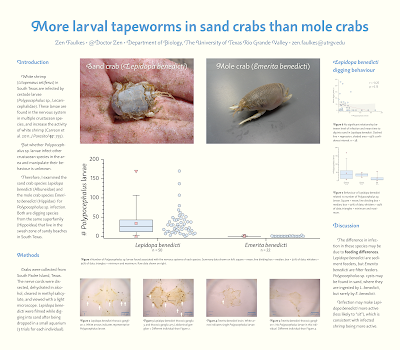
This is one of favourite posters of mine (I’ve shown it before). Click to enlarge!
Right in the middle is a box plot comparing numbers of parasite in two difference host crab species. One species is almost always infected, and the other is almost never infected.
Those are not the only results on the poster. There are more graphs in the right column. But the size and placement is absolutely intentional, because the data were just so clear. You don’t get such sharp, clear, clean differences all that often.
So I made it big. Size is an easy way to signal importance.
(In retrospect, I might have made that box plot higher contrast.)
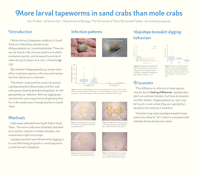
Here’s a quick mock-up of what the poster might have looked like if I just decided to treat every bit of information equally.
I don’t think the poster is anywhere near as strong visually. I’ve ended up with more gray blocks of text and less imagery.
Moreover, it’s arguably less helpful to a reader. Even though the text and data are the same, the information presented in the poster is different.
Layout contains information. The size you make something on a poster contains information. By making everything the same size, a reader has to do much more work to extract what on the poster is important.
Make that hard editorial decision. Decide which experiment, which data, which plot, matters the most. Then make it clear visually that it matters the most.
Happy Canada Day! 🇨🇦


No comments:
Post a Comment
Comments are moderated. Real names and pseudonyms are welcome. Anonymous comments are not and will be removed.