TL;DR: Artsteps provides some nice features for virtual poster sessions, but it is hampered by clunky navigation and limited resolution to view posters.
• • • • •
When many conferences flipped to online events starting in 2020, I have been trying to track how academic conferences have tried to handle poster sessions. Not only is this an issue for large national and international conferences, but individual institutions are trying to deal with how to hold their own poster sessions.
Artsteps provides a service to host “virtual reality exhibitions.” It was used by the student research office at The University of Texas Rio Grande Valley to host showcases of undergraduate student research.
Click any of the images below to enlarge!
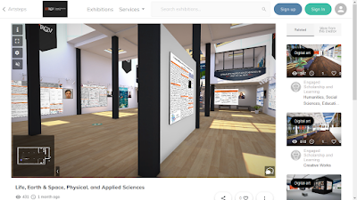
The session takes place in a three-dimensional virtual environment.
You click and drag the window to look left, right, up, or down.
The navigation experience using the mouse reminds me most of the “Street view” in Google Maps. It’s not smooth scrolling through an environment, as with you might get with a first person video game like Doom or Metroid Prime (yep, going old school for those references).
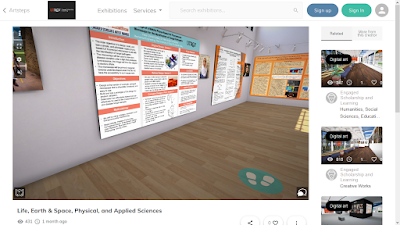
Instead, if you look down at the floor, you can click to place “footprints” to indicate where your want to got next.
This is a somewhat frustrating way to navigate. It’s incredibly difficult to judge the placement of the feet so that you are a reasonable distance from a poster. It’s easy to come in way to close, and there isn’t (as far as I can see) an easy command to take a step back. You have to turn the room around, walk away, turn the room around again, and look at the poster.
(Edit: I discovered you can use the arrow keys on the keyboard to navigate, which is a significant improvement. It provides smoother movement through the environment. It’s just not immediately obvious that you can do that.)
I think this ability to see something from many angles would be awesome for something like a virtual sculpture. But for posters, you mostly want to see them dead on, not from an angle.
The photographs of the presenters are a nice touch.
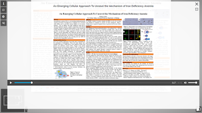
The posters are clickable. Clicking a poster brings it to the foreground and “flattens” it so it’s facing the screen dead on. Clicking the poster also open a pop-up window that allows you to click to play narration recorded by the presenter.
This media window initially overlaps the full screen poster. A little frustrating, because you probably want to see all of the poster while you’re hearing the presenter’s tour.
Once you have made the poster full screen, there is no option to zoom into a particular section. This was frustrating, because I found a lot of posters had detail that was difficult to see. I am viewing this session on a laptop, which may have a lower screen resolution than many people are using for desktops now. Even so, it’s not like I am viewing these through my phone.
Not being able to resolve detail could be solved by good design for this specific platform, but a “zoom” or “magnify” tool would be super helpful.
Some presenters worked around this by presenting what appeared to be a slide deck of rotating images rather than a single static poster.
There are chat boxes and other features that you can presumably use during scheduled presentation times. Unfortunately, I did not see this during the scheduled presentation time. It suspect that it would work okay for small groups, but I don’t know if this experience would scale to, say, the hundreds or thousands of posters needed for a medium or large conference.
As the name implies, Artsteps seems geared to reproducing the small, intimate feeling of walking through a little art gallery with paintings, photographs, and scultures. I’m not sure that experience is quite what is needed for online poster sessions.
External links
UTRGV Engaged Scholar showcase November 2020
UTRGV Engaged Scholar showcase May 2021
Related posts


No comments:
Post a Comment
Comments are moderated. Real names and pseudonyms are welcome. Anonymous comments are not and will be removed.