This week, I am pleased to be speaking at the National Biotechnology Conference! I’ll be presenting on Thursday, 20 May, at 8:00 am Eastern Daylight Time on poster design.
Some of the conference content was available last week, so I went in and looked at how this meeting is handling posters.
As I’ve mentioned before, the concept of a “poster session” in an online space is an interesting thing. Different meetings have handled them in very different ways.
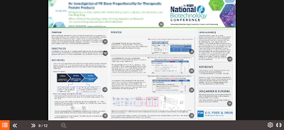
Below is a screenshot of one sample poster, just pulled by happenstance. I have blurred the title and authors, and at the preview scale, the rest is not really readable.
The conference provided a limited number of poster templates, so my focus is not on the poster design, but the viewer experience.
How it works is that when you click “View eposter,” a preview screen pops up that shows you an overview of the entire poster.
You can see controls for the poster – menu, forward and backward arrows – down in the lower left corner.
If you read comics using an app like Comixology, the poster experience is rather like their “Guided view.” You step through each individual panel of the comic or poster, then advance to the next one. In the poster situation, though, you have the option of playing narration.
The poster is scattered with little “sound” icons. These are obviously added in by the software, because the icons cover
parts of text and graphs. There was clearly no consideration of where
the icons would fit into the design.
Every section with an icon has a pre-recorded message.
When you click play, you can hear narration recorded by the presenter. There is no “autoplay” through the entire poster. You have to click to advance to each section.
Judging from a few posters picked haphazardly, if you just listen at
normal presentation speed, it takes about six to eight minutes to listen
to a presenter walk you through a poster.
Luckily, the “speedometer” icon allows you to play it faster (unspecified, but I think it might be 1.5×, 1.75× and 2× regular speed). A nice touch.
I have not made a comprehensive review of all posters, but I will say that sometimes listening to the narration is an odd experience. On text blocks, many presenters start reading the text exactly as written on the poster, but then deviate from it at unpredictable points. The transition from following along to trying to parse the difference between what is written and what is said is jarring.
It feels a lot like people reading PowerPoint slides. And we know what crushing experience that is. Most people read faster than presenters talk.
Eposters mimic one aspect of some paper posters. Despite seeing only one panel at a time, it’s often hard to read the text because people write too much stuff that is too small. Even when I’m viewing a a single panel full screen, I see sections that I cannot hope to read without learning in uncomfortably close to my screen.
You can also download the poster as a PDF.So while this is technically a kind of interesting way of presenting, I’m still unsure why this should even be called a “poster.” In practice, it feels like it would be much more natural either to have people record slide talks or upload a single static document, like a manuscript.
External links
National Biotechnology Conference


Good questions! Posters are highly valued by AAPS' scientist-members -- 90% of attendees at a live meetings report viewing at least one poster, and 95% of authors have at least one conversation about their poster with someone.
ReplyDeleteThe number of authors having conversations is actually one of our key measurements for the performance of the poster program -- and the hardest part of the poster experience to move online. We have been experimenting with different tactics for helping authors talk to other scientists about their work, including the Connect 360 networking platform attached to the NBC. We're also introducing Poster Social Hours at the NBC -- perhaps you'll pop in and see how that goes?
One of the points members have made clear to staff like me is that they think the value of the poster is as much in the conversation it starts as in the image itself. They really want to hear an author talk about their work, and to ask them questions. To them, a poster is also a conversation.
I've seen a poster presentation technology that moves away from poster-as-static-image and toward poster-as-manuscript. Using a database-driven display, it allowed authors to enter as much information as they wanted and then produced a PDF document that looked a lot like first-draft journal article for the viewer. I asked some of our scientists about it informally, and reaction was mixed. They really want a conversation, not a reading assignment.
Looking forward to your session!
(Also, yes, everyone needs to use bigger type and fewer words.)