Recently, I talked about type as a form of technology. I was more interested in the idea of the shapes of the letters and numbers and the amount of special symbols, so overlooked something kind of obvious.
Fonts are technology, too. And more obviously so.
(Aside: Typefaces are styles and shapes of letters. The fonts are the way those style get implemented. Type is like a song, font is like the recording of a song.)
One of the biggest additions to type technology is the addition of variable fonts.
The issue that variable fonts can solve is that because of various optical effects, you can’t make a thin letter into a thick letter just by thickening the lines. Well, I suppose you can but it doesn’t look right. And two letters that should be the same point size no longer are the same height.
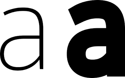
Type creators go to great lengths to tweak letter forms so that thick and thin letters both “work.” In the example below, notice how the width of the lines making up the thin letter are uniform, but the lines making up the thick letter vary. It’s particularly noticeable where the bottom loop connects with the right vertical.
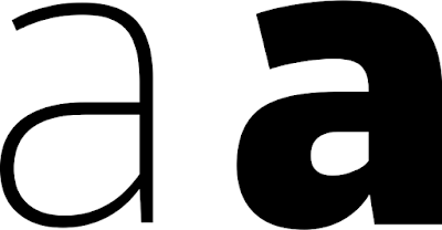
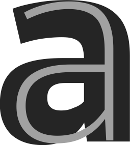
Here’s another way of comparing the light and black weights.
In the past, you were limited in your choices by the number of specific weights a type designer decided to create and release. If the designer made medium and black weights, too bad in you wanted a thin weight. If their “thin” was too thin and the next step up was too thick, you had no options.
Variable fonts let you change the weight of letters as little or as much as you want. Instead of buying half a dozen separate fonts, you can buy one and scale it to your needs.
In the examples above, the letter “a” came from “Thin” and “Black” weights. But a single variable font lets me go all the way from one to the other.
In CorelDraw, variable fonts are controlled by a simple sliding bar that appears when a variable font is selected.
For this particular font (Goldman Sans VF), the “Weight” goes from 200 to 900. I do not know what those numbers signify. They vary from font to font.
But wait! It gets even better! Some variable fonts allow you to control the width, too!
Again, the numbers presented as options have seemingly arbitrary high and low points. Width for this font, Bahnschrift, vary from 75 to 100. I think those numbers are set by the type designer.
But wait! There’s more! Some variable fonts allow you to control the slant, too! I don’t have an example myself, but it is mentioned in the description for Sharpe Variable.
Snare is a variable font where you can control the height of the typeface.
The price for variable fonts is, not surprisingly, higher than individual fonts. But you have to realize that a single variable font can take the place of two, three, or more fonts and give you finer control over the letters.
I happen to have used a couple of fairly conservative sans serif fonts here, but more and more variable fonts are being released. Some new, elaborate, beautiful script and display fonts are coming out. Some old classics like Univers have been upgraded with variable fonts. You can filter Google Fonts to show only variable fonts.
The font names usually specifically say, “Variable” in them. So searching for that word in a font shop will usually bring up fonts with that option.
Having said all this, you probably would not need to use variable fonts on a poster very often. Usually I’m telling people to pull back on the variation in their text, not add even more. But it is always nice to know what your options are.
Related posts
Type as technology


No comments:
Post a Comment
Comments are moderated. Real names and pseudonyms are welcome. Anonymous comments are not and will be removed.