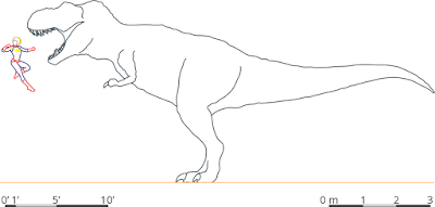
In the Better Posters book, I wanted to show the value of using a relatable objects for scale. Because it’s one thing to say “an animal was 4 meters long” and
another thing to understand viscerally what that means. It usually means comparing that to something you interact with all the time.
I was inspired by the convention in paleontological drawings of showing reconstructions next to the silhouette of a human figure.(Can’t remember what artist pioneered that as a convention, although it has a long history.)
I created these images in 2019, which partly explains my use of Captain Marvel. I liked the idea of using a woman for scale, because too often male figures are the default.
I think I thought that a poor placid plant-eating brachiosaur didn’t deserved to be punched by a super hero, so I made this alternate.
Unfortunately, all of these figure were nixed from the book. The site that provided the scale drawings, Dimensions.com, allows for their work on things like blogs but not for things like books.
I was pleased with these, because I thought dinosaurs and superheroes made the point in a fun way.


Nice Information...
ReplyDelete