I recently ran across a figure in a journal (and a journal I respect) that made me look sideways at it. I am suspicious of composite, multi-panel figures at the best of times. But oh boy.
First, this was the layout of the elements in the figure.
Nine elements should be easy to lay out. Make a three by three grid heights and widths. Instead, we get this bizarro layout where only two elements are the same height or width (bottom right corner). The five and eight sided polygons in the middle are making me cringe.
But based on the blocking of the elements, I thought I might be able to go through the figure in a sensible way. It looked to me like I should go across, then down.
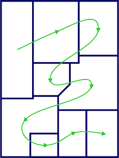
But no. When I looked at the numbering and figure legend, I found I was supposed to read the figure in this order.
So the actual reading order for this figure is a drunkard’s walk that includes right to left transitions and backtracking across previously covered terrain.
At least the ordering starts in the upper left and ends in the lower right.
I can understand authors making a figure like this. Scientists are not graphic designers. But what I can’t understand is why a journal editor didn’t have something to say about this. Something to say as in, “Redo that figure.”
Posters are deeply influenced by journal articles. They almost always have the same elements as a journal article, even though there is rarely a need to imitate the format. So slipshod graphics in journals have a ripple effect. They sets a poor example that readers who later make posters might imitate. People think it’s published so it must be okay.
It could be so much better.
I get the impression that a few journals have dedicated graphics staff who often work with authors on their illustrations. I wish that professional graphics designers were employed more widely by journals, and that the journals advertised that.


No comments:
Post a Comment
Comments are moderated. Real names and pseudonyms are welcome. Anonymous comments are not and will be removed.