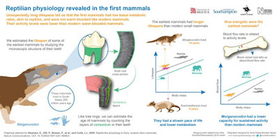
This infographic by Nuria Melisa Morales García could just as easily go onto a poster board at a conference. Click to enlarge!
The highlight of this is clearly the skill of rendering. I love the mammal head and teeth over on the left. I love how callouts and arrows are used to guide you through the left half. I love the hand being used for scale to show the size of the animals. I love the icons in the line graph on the right.
The left and right feel a little disconnected, in part because the title ends very close to the central divide. I would like to see the title bigger and running further across the top. This might means the logos got the bottom instead of the top.
Under the title is a summary:
Unexpectedly long lifespans tell us that the first mammals had low basal metabolic rates, akin to reptiles, and were not warm-blooded like modern mammals. Their activity levels were lower than modern warm-blooded mammals.
Currently, this mainly says the same thing as the title, just in several sentences instead of one. I might reword this to a narrative:
Modern mammals are warm blooded and have shorter lifespans than modern reptiles, but ancient mammals had longer lives, from which we conclude their metabolism was like modern reptiles.
Over on the right, the two graph have many nice parallels. They are both line graphs (even with similar trendlines!), both use the same colour scheme, both have icons for the animals. I wish they were even more similar.
The leftmost graph sits higher than the rightmost graph. I so badly want the graphs to be aligned, so they two X axes sit at the same height. I just want to grab the rightmost graph and move it up so it sits
side by side with its left partner.
The leftmost graph has a summary statement above it, but the rightmost graph has a question above it.
The left graph has a picture above and below the graph, but the rightmost graph only has a picture above it.
I might tackle this by removing the Kuehneotherium in the left graph. It doesn’t appear anywhere else in the graphic, so its role is a little bit unclear. The would create the space to move the left graph down to the same height at the right one. A little text editing would be able to make the text above and below the graphs fit the new space better.
ReferenceNewham E, Gill PG, Brewer P, Benton MJ, Fernandz V, Gostling NJ, Haberthür D, Jernvall J, Kankaanpää T, Kallonen A, Navarro C, Pacureanu A, Richards K, Brown KR, Schneider P, Suhonen H, Tafforeau P, Williams KA, Zeller-Plumhoff B, Corfe IJ. 2020. Reptile-like physiology in Early Jurassic stem-mammals. Nature Communications 11: 5121.https://www.nature.com/articles/s41467-020-18898-4


No comments:
Post a Comment
Comments are moderated. Real names and pseudonyms are welcome. Anonymous comments are not and will be removed.