One of the most frequent questions I get when I talk about posters is, “What’s a minimum point size?” I got it a few weeks ago when I was speaking at the Plant Biology meeting. If you’re a regular reader of this blog, you might guess that it’s hard to answer this question. But in general:
Your poster text is too damn small.
One place we can look for guidance for text size is the Americans with Disabilities Act (ADA). This year marks the thirtieth anniversary of the act, which was a big win for people with disabilities in the United States. The ADA has a lot of specifications intended to maximize accessibility for people, including people with visual limitations.
Not surprisingly, the ADA does not offer guidance for academic conference posters. But it does offer guidance for signs. Signs are probably a pretty good parallel for conference posters. Both need to be visible from a distance and easily read, even for someone with less than perfect vision.
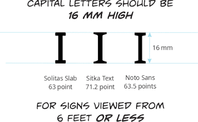
Rather than using point size, the ADA makes recommendations based on the height of capital letters; the uppercase letter “I” if you want to be specific.
The ADA requires that the capital “I” on signs be 16 mm tall if you are viewing from six feet or less. That is the usual kind of range people are viewing conference posters. That’s usually in the ballpark of a 66 point font. Point size is not a precise thing in digital fonts, so you have to double check the exact point size.
If you are viewing from further away (as someone might be when reading your poster title, say), the required minimum size goes up. For ten feet, that recommend height of capital letters is 28.8 mm, which is around 120 points.
Those ADA requirements for signage asks for text that is much larger than I usually see when people talk about “minimum point sizes.” I usually see recommendations like, “No smaller than 24 points” (that was AGU’s recommendation last year for body text, for instance) – less than half the ADA standard.
Of course, the ADA is not the only guidelines out there for making visual material accessible to many people. I’m sure other nations have developed their own standard for accessibility.
Nor I am not saying your academic conference poster needs to be ADA compliant. But I think this is a good example of a mismatch between the concern of many academics, which is “Show as much stuff as I can” and the concerns of people thinking about accessibility, which is, “Make is visible to as many people as I can.”
When face-to-face poster sessions return, consider it a challenge to make your poster ADA compliant!


No comments:
Post a Comment
Comments are moderated. Real names and pseudonyms are welcome. Anonymous comments are not and will be removed.