Hat tip to Janet Stemwedel for realizing:
Thing I haven't seen yet this pandemic but which I suspect already exists: cloth face masks made from old cloth conference poster.When I tweeted I would pay money for that, Alexandria Hughes replied with the picture above. Outstanding!
Possibly with matching sundresses.
• • • • •
And the end of April, Amy Frietag posted some art that cropped up in her neighbourhood, saying “Sure is a sign of the times.”
I’m fascinated by this, because it shows the power of a visual.
The sculpture is obviously showing the SARS-CoV-2 coronavirus. But SARS-CoV-2 didn’t really exist in the public imagination even a few months ago. If you had put up a white ball with red spikes in February or even March, I doubt people would have thought, “coronavirus.” It’s because of the illustration made by CDC illustrators Alissa Eckert and Dan Higgins that we now have a shared visual “identity” for the virus.
And it is definitely the Eckert and Higgins illustration that is the source material here. Because a virus doesn’t have colours. There is no particular reason to make a sculpture of the virus white with red spikes, except because the CDC illustration is white and red. Eckert and Higgen chose those colours to signal that the virus was a serious threat, not because there was any scientific reason to pick them.
• • • • •
So research conferences are cancelled. Now what?
Hat tip to Melissa Vaught.
• • • • •
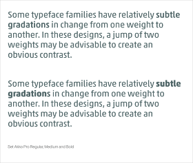
How to use bold type effectively.
That’s only one example; the article has more!
• • • • •
Make your own Penguin Classic book cover.
This was only done as a demonstration! I have been loving working with Pelagic Publishing!


Link to bold type post is broken for me
ReplyDelete