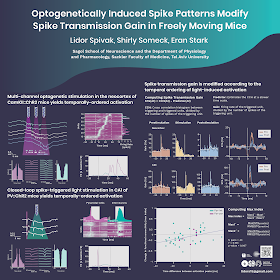
The poster was designed by Eden Spivak. Yes, the same last name is not a coincidence: Eden and Lidor are married.
While I tell people that you don’t have to draw to do graphic design, a quick browse at her website shows Eden certainly can draw! It is intimidating to be asked to comment on someone who has skills.
Some signs that this was done by a pro include:
- Consistent colour palette, in cool blues and greens.
- Consistent font use.
- Wide margins.
- Nothing pushing in touching, or almost touching, anything else.
My main concern is whether this poster can be understood without a presenter. Particularly on the right side, there are descriptions that cover four separate diagrams, none of which have explanations. I do neuroscience, and even I would have to guess at what is going on in the individual graphs more than I’d like.
There are a few points where a few more edges might be aligned. For instance, there's no reason the right edges of these two graphs couldn’t be aligned. Yes, it would take some fiddling with the aspect ratio, but it could be done.
Finally, while I admire the consistency of the colours used, I am a bit concerned as to whether it might be visible to someone with colour blindness. Here’s that panel above run through a colour blindness simulator, using the “green blind” setting:
It’s probably interpretable, but the differences between the two curves at top don’t pop out very much. A little more variation in brightness might be useful.
Always nice to see a pro at work!
External links
Eden Spivak - Illustration and Writing


No comments:
Post a Comment
Comments are moderated. Real names and pseudonyms are welcome. Anonymous comments are not and will be removed.