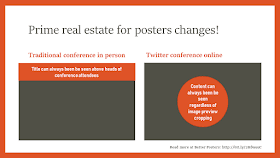
More academic societies are hosting events on social media. One established example is the Royal Society of Chemistry Twitter Poster Conference 2019 (#RSCPoster), which is heading into its fifth year!
If you want to participate, here are my top tips.
Design within size limits.
Twitter will only post images 5 megabytes (MB) or smaller. As a designer, I usually want to know the height and width of my image in pixels, not the file size. There isn’t a simple relationship between image size in pixels and file size. Greyscale images can take up less space than colour. Different file formats use different numbers of bytes.It’s worth briefly comparing the three image formats Twitter accepts.
- GIF: Small file size because of its low colour resolution (8 bit colour). The only one of the three that supports animation. If you use a limited colour palette, GIF is a good option for making a large image with a small file size.
- JPG: Small file size because of image compression. The amount of compression varies, and it is often unnoticeable if compression levels are low. But the nature of the format is that it always causes slightly lower image resolution. The advantage is the format (why it was created in the first place) is its high colour resolution (24 bit colour).
- PNG: High colour resolution (24 bit colour) and uncompressed.
Update, 4 March 2019: I found a web page to estimate file size from number of pixels. Using it, an GIF image (8 bit colour) could be about 3,000 × 1,500 pixels in size and come in under Twitter’s 5 MB limit. But a PNG image (24 bit colour) is more likely to be in the 1,800 × 900 pixels big.
(Yes, I know this is a bit of an eleventh hour update. Sorry.)
Keep crops in mind.
If something important or attractive is sitting outside the preview window, people are less likely to click the whole thing.
According to sites like this and this, Twitter shows sizes anywhere from 440 × 220 pixels to 1,024 × 512 pixels, and these sites recommend using images with a 2:1 ratio in landscape. Looking at Twitter on my desktop now, I see lots of preview images that are not in that ratio.
But there are many other apps that people may use to view tweets, and their preview images are different sizes. Tweetdeck seems to use a preview image that is close to a 16:9 ratio. The Android app Talon seems to use a 3:2 preview image. Because different apps will crop your image to fit their own preview window, there is no optimal image shape.
But there is something consistent: all these apps crop the edges of images. Make sure your most recognizable image, the one that tells a viewer what your poster is about, is in the middle of your poster. You might consider even working your title into the middle so that it is always visible.
Update, 5 October 2019: I didn’t realize it at the time, but Twitter is now using an algorithm to show the “most interesting” part of an image.
In most cases, this means that it will show a face in the preview window if there is one.
This makes knowing what your preview image will be even more complicated. On the one hand, you may be able to use that to your advantage if the image has a clear focal point, like a face. On the other hand, it means there is even more variation in how your image will appear from platform to platform.
Use animation if appropriate.
Animation is hard on paper, but easy on Twitter. And animation is more engaging that still images. Twitter supports GIF uploads, although again, there are file size limits (5 megabytes on mobile, 15 megabytes on web).There are lots of ways to make GIFs. I recently found the gifmaker.org website to be quicker and more efficient than my graphics program.
Edit yourself ruthlessly.
This is Twitter. A forum that built itself on being short, sharp, and to the point. Some of use remember those hard honed skills when there were only 140 characters, including retweets and pictures. It took real skill to craft good tweets, especially retweets.Be like old school Twitter.
Make a single point.
2016 RSCPoster presenter Helen Casey puts it this way:
My advice to participants is to make your poster as simple and effective as possible. Really get the take-home message across.
Editing yourself is hard, as I’ve talked about before. This is why it’s good to show your work to other people.
Related posts
#RSCposter 2018
Four simple tips for shortening your poster
External links
How to post photos or GIFs on Twitter (Twitter document)
Always Up-to-Date Guide to Social Media Image Sizes
Twitter is using machine learning to crop photos to the most interesting part
Twitter’s latest photo update is so brilliant you won’t even notice it
Twitter image from here.


No comments:
Post a Comment
Comments are moderated. Real names and pseudonyms are welcome. Anonymous comments are not and will be removed.