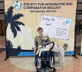
I’ve visited the issue of poster accessibility on this blog, but mainly in the context of visual issues, like colour blindness and dyslexia. Of course, these are not the only challenges the people might face attending a scientific conference. Amy-Charlotte Devitz, a.k.a. The Bendy Biologist on Twitter, has a great blog post talking about navigating a scientific conference in a wheelchair with a service dog. The conference at hand is the Society for Integrative and Comparative Biology (SICB) meeting this month in Tampa, Florida.
Here’s an excerpt, focusing in on what she says about poster sessions (emphasis added).
100+ posters were on display and you had a chance to interact with those who had made them. These were admittedly a bit of a challenge to navigate in a chair. It was crowded, meaning it was very hard to move around, and with so many people around I wasn’t able to get a proper look at many of the posters. The alternative was to come and look at the posters before the official sessions started, a time when very few people were present, so I did this often. The downside of this was that one, the presenters weren’t there to speak with and two, it meant skipping other events to come look at the posters. Improvements in accessibility could be made by the increasing the space between rows of posters as well as the posters themselves to open things up a bit. This may be limited by the space available in the venue, but it something to consider.
As I said in the beginning, my focus in this post would be on accessibility for individuals for mobility impairments, but I have a few points left to make. For one, almost every talk I saw used color-blind friendly color palettes in making their slides, and most used large fonts that were easy to read even from the back of the room. Encouraging these in all talks and posters would assure someone colorblind or visually impaired could view any material.
Full disclosure: I was the chair of the Student and Post-Doctoral Affairs Committee during this meeting, so I have a professional interest here above and beyond the usual. I was supposed to attend this meeting, but could not due to unexpected events.
It’s worth noting that SICB’s poster sessions used to allow people to have eight foot posters. Here’s one from 2017. In 2018, this was reduced to less than four feet of space for a poster. I do not know how far apart the poster boards were placed in those years, but it seems likely that the square footage of poster viewing space was probably about halved by this move.
That square footage of viewing space is extremely important for wheelchair users. Whatever reasons there are for shrinking the poster size (and there are probably reasonable ones), this does not change the fact that it virtually guarantees that the poster session is a worse experience for everyone, even if wheelchair users are a little more affected than most.
There is a lot more in Charlotte’s post, and I recommend it highly to you.
External links
SICB 2019 – An accessibility perspective


No comments:
Post a Comment
Comments are moderated. Real names and pseudonyms are welcome. Anonymous comments are not and will be removed.