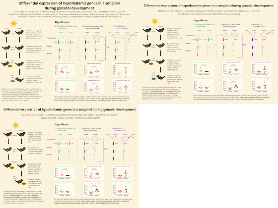
Today’s poster comes courtesy of contributor Carolyn Bauer. Her work has been featured before, and I’m pleased she liked the experience enough to come back for seconds! Click to enlarge this poster that was recently presented at the International Congress of Neuroendocrinology!
I like this. The illustration on the right is an approachable entry point. I also like the columns, one for each hypothesis.
What I wasn’t as crazy about was the title area. Two lines for the title and three for the authors was chewing up a lot of space than it needed. I changed the all capital names to regular letters, and dropped a lot of department affiliations and cities that I honestly think nobody cares about.
Some of my other revisions were my most common ones: to open up the margins, both around the border and between elements. In the revision below, there’s at least an inch around the edge.
I continued along with a few other changes. One of the things that bugged me was the birds are all facing to the right in the infographic... except one. So that bird got flipped! There were some other minor little movements to get the birds more in alignment in a column, too.
I also made a few little edits to the text to make the capitalization of the labels consistent. I tried a more condensed font and some light editing to make some of the labels fit the space a little better.
After those changes on the top and left, I still think the right side could use some improvement, but I’m not sure how. The “Hypothalamus / Pituitary / Gonads” labels essentially stick out into a margin between columns where nothing else is, and the look terribly intrusive. I’m not sure how to fix that. I might try rotating the words 90°.
Here are the changes in animated form:
Related posts
Critique and makeover: Migrating birds


No comments:
Post a Comment
Comments are moderated. Real names and pseudonyms are welcome. Anonymous comments are not and will be removed.