For a long time, Arial was the default sans serif in Windows. Arial is okay, but suffers from overuse. (And purists know Helvetica is better.)
More recently, Calibri has taken the place as the default sans serif on Windows. Calibri is a well designed typeface, but is starting to suffer from the same “it looks like someone can’t be bothered to change the default font” that plagued Arial. It can look lazy.
For some time, Gill Sans has been my “go to” typeface for posters, because I think it holds up well when viewed from a distance, as on a poster. But Gill Sans is somewhat dated, and I wanted a more modern typeface.
Making my last two posters, I tried two new options.
First, there is Corbel.
For some reason, I had not paid attention to this font before, even though it has been on my computer for several years, and it now a standard type for Windows.
When I was laying out a poster recently, I had the text in Calibri, and was looking around for different options. I had the poster minimized so I could see the whole poster on the screen, and the text was just barely readable. When I switched to Corbel, the readability of the text immediately increased. Calibri is a rather compact typeface, and Corbel is wider, which helps when you’re reading text from a distance.
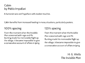
Second, we have Cabin.
This is a descendent of Gill Sans and its fellows, and has some of the same advantages in terms of it legibility from a distance. It has some advantages, however, such as being able to distinguish a 1 from a lowercase l more readily than in Gill Sans:
I do admit that there is something about the detail and character of Gill Sans that I still prefer, though, when seeing the two side by side.
As shown in the example above, Cabin is tight in the vertical, and can looks too dense when set with the default spacing. A little adjustment in the line spacing helps substantially. But remember that in general, poster text will be better if you increase the line spacing from 100% to 110% or more.


What are your thoughts on the font called Gisha?
ReplyDeleteHm. Potentially another good option. It looks like the lowercase letters are a little larger (higher x-height) than, say, Corbel. Again, would probably benefit from increased spacing between each line.
ReplyDeleteHave you checked the numbers of Corbel font? That seems oddly.
ReplyDeleteHave you checked numbers in the Corbel font? That just looks oddly.
ReplyDelete