25 October 2012

Link roundup for October 2012

Neuroscience

It’s the month of Neuroscience, the biggest collection of conference posters maybe anywhere. Lots of people offered advice for presenting posters at that conference, which has the advantage of applying to almost any other conference you might attend.

Neuropolarbear gives advice on presenting a poster: be able to do it in less than 5 minutes.

Don’t even practice a longer version. If people want more detail, they will ask about the parts they care about. That’s the brilliance of a poster, as opposed to a talk.

Drugmonkey has a follow-up.

Ask the person to tell you why they are there! Really, this is a several second exchange that can save a lot of time.

The Cellular Scale has more suggestions:

They say you only need to be there during the one hour that you are scheduled, but it's a good idea to be there basically the whole time.

And when you’re at your poster, In Baby Attach Mode reminds us to introduce people we know to each other.

(I)t’s a small gesture to introduce people to each other, but that it makes a huge difference in how you make people feel.

Scicurious covers a poster presentation experiment (that I’ve featured here on this blog, but worth revisiting). Next,  In Baby Attach Mode ponders dress sense at posters. Virginia Hughes also picks up the cause on Twitter. Finally, to round out the trilogy, here's a full-length post on conference clothing.

The Cellular Scale finds another candidate for worst poster ever at Neuroscience.

No graphs only words, well one picture of a whole brain, and TABLES! oh the tables that should have been graphs! But it wasn't just the layout, the presentation was rambly and confusing.

Katie wondered how many figures should be on a poster, and provided some field data from the Neuroscience conference floor:

(I) saw everywhere from 6-40+ in my row of posters.

My response: As many as you need to tell the story. Just remember that posters are good for short stories, not epic novels.

Drugmonkey on how to turn people away from your poster:

Title items that cause me to skip your poster “mechanism of”.

Similarly, Dr. Leigh asks:

Why do people title their poster/talks “evidence for [phenomenon]”? Why not just say what the phenom is, we assume you’re presenting evidence.

Bradley Voytek wanted this:

Someone should start a DejectedPosterFace tumblr for that look students have when they're standing at their poster all alone. So sad!

Your wish is my command, sahib.

Jason Snyder finds people who seem to be all postered out.

And I love this picture from Shelly Fan on a plane going out from New Orleans after Neuroscience.


And do not make jokes about their resemblance to any sort of weapon!

Shelly Fan made her own poster tube strap.

Even after it was all over, some people just couldn’t stop presenting! This was spotted in the New Orleans airport at 7 am the day after Neuroscience closed:


If someone does this next year, it will become tradition.

NeuroPolarBear has a round up with great tips for organizers.

One of the things I most wanted to see was the debut of “dynamic posters” at Neuroscience. So far, I’ve only found one comment about them:

But what really caught my attention at SfN 2012 is that Voytek and Warp were presenting “The Adventures of Ned the Neuron” and its development via a “dynamic” poster. That means they presented their story and concept on a large digital flat-screen rather than on the traditional posterboard in the conference center. No thumbtacks needed.

Warp tells me that SfN contacted her and Voytek to tell them they’d been selected as part of a pilot program prior to the meeting. Apparently, there was one dynamic poster presented during each poster session over the course of the conference. Presumably, if the feedback is good, we’ll see more neuroscientists presenting their colorful, three-dimensional data on flat-screens in the future. Say goodbye to those poster tubes and trying to cram them into the overhead bin on the airplane, kids.

Society for Vertebrate Paleontology

Neuroscience was not the only conference this month. We also had the Society for Vertebrate Paleontology. And I have to say that it’s a paleontologist, Tony Martin, who gave me the biggest smile this month in poster-related news with... Paleontologist Barbie.


This is one of my favourite things about posters: you can do things that you cannot get away with in a paper.

Meanwhile, Bora Zivcovic offers a great approach to reading posters, and a reminder about why you want to make a good one (my emphasis):

I think, in any field, the most interesting work is done by junior researchers and students, and what they say (and the enthusiasm by which they say it) may be more revealing about the future of a field. Which is why I focused on the posters. ...

I went to see the posters every day during lunch break when the posters are already up, but people are not there yet. I checked out every single poster, in order to get a feel for the field as a whole. Then I would focus on, and completely read, 4-5 posters each day. In the afternoon, when the poster sessions starts, I homed in on those 4-5 posters and talked to the authors, asked more questions. A number of those posters will end up here on our site, written by authors on the Guest Blog, over the next several weeks and months.

General

Finally, a bit of a “how to” article about making inforgraphics look good without compromising the integrity of the information.

18 October 2012

The Better Posters workshop

Although I’ve been doing this blog for a few years now, I had never given a presentation or workshop trying to distill some of the best tips and ideas until this week. I gave two workshops at my institution in preparation for an undergraduate research conference to be held next month. Thanks to Danika Brown for livetweeting.

I’m hoping these will not be the last time I give this presentation. Have slides, will travel!

American Physiological Society poster course

The American Physiological Society has decided to provide a course on poster-making. I’m pleased to see at least one scientific society taking a more active interest in poster presentations! The text below is pulled from this PDF. I’m tempted to take it myself to see what there is to learn, and how other people do things.


2012 Professional Skills Training Course: Creating a Poster for a Scientific Meeting Online Course

Does Your Poster Have All of the Necessary Pieces?

How is the course structured?

  • 7‐day online course (November 15‐21)
  • All exercises and course materials are accessible 24/7
  • Discussion boards will allow you to interact with top faculty and peers
  • Course will be taught in written English

What is my commitment?

  • Dedicate approximately 1 hour a day to the online course
  • Complete all lessons on time and participate in all aspects of the course
  • Thoughtfully complete all the evaluations before, during, and after the course

What is the cost?

  • APS Member Price ‐$90 (you must be a member at the time of registration to qualify for this price)
  • Non‐Member Price ‐$180

What hardware or software do I need to have?

  • Computer with internet access (preferably high‐speed internet)
  • Software:
    • Browser: Internet Explorer or Mozilla Firefox ‐recent version
    • Microsoft Word
    • Adobe PDF reader (free download)
    • Macromedia Flash Player 6.079 or later (free download)


Register Online 1‐31 October2012.
Go to http://bit.ly/SJ8gNT, select the “Creating a Poster for a Scientific Meeting” link and register.

Hat tip to Janet Stemwedel.

11 October 2012

Worst of the worst?

Worst venue?

Overheard at a conference over summer: a poster session at another institution that decided to hold a poster session outdoors. in the height of August.

Apart from uncomfortable heat, unpredictable weather, wind catching posters... What could possibly go wrong?

Worst poster?

On Twitter, RuthFT shared “the worst conference poster I have ever seen.” It graced(?) the halls of the International Symposium on Archaeometry.


In fairness, Ruth noted:

It is very hard to do a poster for a heavily interpretive subject. Always too much text, but how else to explain/justify interpretations?

True. But even this could be improved by:

  • Putting the title in the upper left corner instead of the upper right.
  • Separating the rows to indicate that you were supposed to read across instead of down.
  • Better still, making the reading order go up and down instead of across, with space between each set of columns.
  • More careful proofreading to fix things like “objetives” instead of “objectives” in headings.
  • Keeping the type consistent; in particular not switching to italics in the Results section. 

Several of those changes only required paying some attention when hanging the poster. I almost wonder:


04 October 2012

Dynamic posters preview

I wish I could go to this year’s Neuroscience meeting, but cannot, so I will miss the debut of “dynamic posters.” But a preview is available here, where we get a better idea of what this involves.

The size of a dynamic poster is 4 feet, 4 inches wide, which compares quite favourably to the paper poster size of 5 feet, 8 inches. The downside, as I see it, is that it is being controlled by a laptop, which has got to be a substantial cost and annoyance. To make this attractive, I think there will have to be a move towards a more iPad like experience, where you simply upload the poster, and can navigate with a touchscreen.

Related posts

As was foretold by prophecy
Poster session 2032

External links

Dynamic posters

New type

I am a sucker for sans serif type on posters. But sometimes, it seems that the choices are somewhat limited for Windows users.

For a long time, Arial was the default sans serif in Windows. Arial is okay, but suffers from overuse. (And purists know Helvetica is better.)

More recently, Calibri has taken the place as the default sans serif on Windows. Calibri is a well designed typeface, but is starting to suffer from the same “it looks like someone can’t be bothered to change the default font” that plagued Arial. It can look lazy.

For some time, Gill Sans has been my “go to” typeface for posters, because I think it holds up well when viewed from a distance, as on a poster. But Gill Sans is somewhat dated, and I wanted a more modern typeface.

Making my last two posters, I tried two new options.

First, there is Corbel.


For some reason, I had not paid attention to this font before, even though it has been on my computer for several years, and it now a standard type for Windows.

When I was laying out a poster recently, I had the text in Calibri, and was looking around for different options. I had the poster minimized so I could see the whole poster on the screen, and the text was just barely readable. When I switched to Corbel, the readability of the text immediately increased. Calibri is a rather compact typeface, and Corbel is wider, which helps when you’re reading text from a distance.

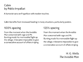
Second, we have Cabin.


This is a descendent of Gill Sans and its fellows, and has some of the same advantages in terms of it legibility from a distance. It has some advantages, however, such as being able to distinguish a 1 from a lowercase l more readily than in Gill Sans:


I do admit that there is something about the detail and character of Gill Sans that I still prefer, though, when seeing the two side by side.

As shown in the example above, Cabin is tight in the vertical, and can looks too dense when set with the default spacing. A little adjustment in the line spacing helps substantially. But remember that in general, poster text will be better if you increase the line spacing from 100% to 110% or more.