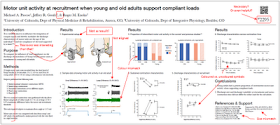
There is a lot to love about this poster.
- Uncluttered. The text is pared down and the graphs are given ample margins to let white space. It is not an intimidating poster. It invites in people, saying, “Hey, I am going to tell you my story and be done in two minutes. It won’t take you half an hour to decipher me.”
- Aligned. The columns are clean (though not perfect).
- There is no confusion about where I should read next, even when the poster switches to the reading order going sideways (Results section 4 to 5) instead of down (the rest of the poster).
- The artwork of the arms in Results section 1 acts as a nice entry point for passers-by.
- It has a QR code, which is at the vanguard of today’s conference poster technology (which I say purely and only because I wrote a blog post about them). Just so you don’t have to scan the image above, it links here. This is a full package of everything someone at a poster session might want to follow-up on.
This poster succeeds brilliantly on those points alone. Do not be fooled that the list I am about to give of potential improvements is longer than the list above makes this a bad poster. It does not. The points above weigh heavily. The points below are trivial.
If I were to pick on a few points where maybe things could be improved...
- The combination of Times New Roman and Arial is readable, but lacks character. A little something more daring, perhaps for the headings, would make this a little less “plain white bread.”
- Arial is used throughout the results, for both sub-headings and graph labels. Those are more text-level than heading level, and putting those in Time New Roman might have been a better match. The poster is perfectly consistent, which is good, but I am not sure if it meets expectations about hierarchy.
- The colours of results sections 2 and 3 could be made more consistent.
- Similarly, the graphs in results sections 4 and 5 use symbols filled with colour, and the graphs in results section 6 don’t.
- Containing only text, that all important left hand column is just a trifle gray.
- I remain unconvinced that poster numbers (in the upper right under the QR code) are helpful to viewers.
- The first section of Results, um, isn’t results. “Experimental setup” should be in methods.
- The two “Experimental setup” pictures are further to the left than the corresponding pictures below them.
- The Results section heading could be made even more descriptive. For instance, instead of, “Sustained contraction characteristics,” it could be worth the extra bit of space to say, “Sustained contraction characteristics differ in young and old.”
- And now we’re down to truly nitpicky stuff... But I am not alone in disliking a comma before an ampersand symbol (in the list of author’s names).


I really love this blog and usually find the comments and advices very helpful for my own poster making. And in terms of this post this is a minor point, and there probably have been comments and discussions about this before. But I have a huge problem with this blog's take on putting poster number being put in inconspicuous corners. Many poster guidelines for various conferences require the authors to put poster numbers on a specific location (upper right hand corner, for example). And personally I find this very helpful when I try to hunt down certain posters to go to. And people usually have the habit of taking poster numbers that are pinned on the bulletin board down to make room for their posters. In short, if you are trying to look for a certain poster at a large conference (which many people do), having poster numbers is necessary and essential. (Same with institutional logos, which I think adds to the aesthetics of a otherwise boring science poster and I find them very interesting to look at. But there have been many discussions on this and the blog has a very strong opinion on that, so I will not dwell on this).
ReplyDeleteThanks for the comments. I appreciate it when people disagree with me, for from disagreement comes improvement, and from improvement comes awesome.
ReplyDeleteAt the conference I am at now, the poster numbers were already attached to the poster boards. There was no reason to put numbers on the poster because they were already there - unless the poster was so big it would cover the number.
Now that I think about it, there was a poster board number in addition to the number I had on my poster.
ReplyDeleteI am just not sure which number was more important to people at the conference. Did the program list both board and poster numbers? What were people looking for?
Even for those with a handout version, the number really doesn't add anything meaningful.