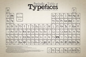
This graphic puts a large number of fonts “at a glance.” Mimicking the periodic table of the elements is an interesting idea, although it’s more a gimmick than anything useful, unlike the periodic table of the elements, which reflects nature.
Found in the article, 40 Useful and Creative Infographics at Six Revisions. Many of the other graphs are worth looking at, particularly for the use of colour and the integration of text and graphics. Many may be too dense for posters, however.

No comments:
Post a Comment
Comments are moderated. Real names and pseudonyms are welcome. Anonymous comments are not and will be removed.