24 September 2020

Link round-up for September, 2020

SciMobi is a new service for delivering poster-like content online. (I say poster like, because if it’s not on paper, is really it a poster?) Phil Greenhalgh has a pair of posts relevant to our interests here at LinkedIn. 

The first is on QR codes. It arrives at the same conlusion of some earlier posts on this blog (always say what they lead to!).

The second is partly about the billboard poster format that has been the subject of much discussion. It uses a nice metaphor of catching. Throw one ball and someone can probably catch it. Throw a lot, and they will drop them. Excerpt:

Alas, when working in some of the most highly regulated industries in the world, the luxury of brevity isn't always one we can afford. The amount of balls is sometimes beyond our control, we are compelled to become jugglers. If the content just positively has to be there, it becomes our job to not throw the balls all at once at our audience, but to hand them safely one-by-one so they are not dropped.

Scimobi will soon have a 15% discount for Better Posters readers! I will announce it on the Better Posters Twitter when it’s ready. Thanks to SciMobi!

Update: The SciMobi discount code is:

betterposter15

It is good for three months (i.e., until mid December 2020).

• • • • •

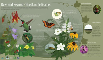
Echo Rivera scored a coup with this awesome guest post from Heather Hinam. Heather makes posters for a living - only she knows them as “interpretive signs” for public displays like parks and museums and the like.

Bees and pollinators interpretive sign

Heather provides a breakdown of her process of making these rich, complex signs. I like this tip: write your text last!

Now that everything is where I want it to be, I finally start writing the text. I know some of you reading this will find it counter-intuitive, but by doing it this way, I never end up with too much copy. I can only fill the space that I have created.

While the target audience is general rather than academic, many academics would do well to look more at these sorts of signs as inspiration!

• • • • •

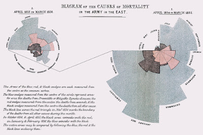
Florence Nightengale, she of nursing fame, was also a dataviz nerd.

Diagram of the causes of mortality in the armies in the east

Hat tip to Emily Anthes.

• • • • •

What art can do for science. Hint: way more than public engagement. How about:

  1. Change your perspective.
  2. Use data to create art and vice versa.
  3. Create new visual metaphors.
  4. Broaden frames of reference.
  5. Get inspired!

At Lifeology.

• • • • •

Kris Faraldo describes how to use PowerPoint make graphics fast with minimal graphics skills. (PowerPoint really is good for quick and dirty images.)

• • • • •

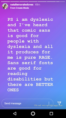
I am a big fan of actor Natalie Morales. Near the end of August, she dished some personal experienced with typography on Instagram.

The fact that people on here have the option to use Comic Sans is very upsetting to me

I'm dyslexic and I've heard Comic Sans is good for dyslexics but all it produces in me is pure rage. There are much better ones.

 As far as I am concerned, her word is law.

• • • • •

The first graphic novel created in India, The River of Stories, was recently reprinted. It’s a story of indigenous people, economic development, journalism, and more.

"The River of Stories" cover

The River of Stories is (mostly) English, and you can view it here (part 1) and here (part 2).

• • • • •

All for now!

18 September 2020

BioRender announces PosterRender

“Darn it, I don’t have a blog post lined up this week. What am I going to write about...?”

[Checks Twitter]

psst @DoctorZen have you seen!?

[Sees]

“Well, that’s this week’s blog post sorted.” 

BioRender just announced a new project, PosterRender. This cloud-based software features automatic alignment and global colour schemes.

It’s rare that I get to say, “Big news in the conference poster world!” But this is big news in the conference poster world.

I knew the company was thinking about a project like this, because a BioRender staffer consulted me at one point about the poster making process. I probably didn’t help much! 

This announcement is getting thousands of likes and retweets. I am not going to lie when I say I have mixed feelings about this. On the one hand, that a successful company like BioRender is throwing its weight behind poster making is fantastic. This will be a great boon for many people. 

On the other hand, the first glance suggests that this fundamentally a souped up template, and I have consistently struggled with templates. Templates prevent people from falling in deep dark holes, but they also generate a certain sameness that can be bland. BioRender figures have a recognizable style.

I also have a bit of a frown because the announcement says this is for people “who spent way too long making poster.” This was also an explicit selling point of the “billboard” style poster, as I mentioned last week.

I don’t like the implication that posters aren’t worth spending time on. 

It reinforces the idea that posters are third-rate ways of presenting scientific information. I never see people say, “You’re spending too much time on writing.” Nobody begrudges a few hours spent on creating a journal article, because people recognize that good writing takes time. Posters are a critical first draft of the scientific record. Take them seriously, damnit.

But I’m probably like the music nerd arguing that vinyl records “sound better” when the rest of the world has moved to listening to streaming music. 

This is going to be a very big success for BioRender and help many people make more readable and more attractive posters than they could have on their own.

Early access to PosterRender is available here. And you better believe I have signed up! I am excite!

Hat tip to Catherine Scott.

External links

BioRender PosterRender early access sign-up


10 September 2020

blog post with conference poster advice

A recent episode of the podcast 99 Percent Invisible looked at the rise of grocery store brands, and spent a lot of time examining generic brands.

No name baking soda

The example pictured is from No Name line of products from the Canadian supermarket Loblaws. In the late 1970s and 1980s, Loblaws started these generics as a cheaper alternative to national name brands. 

Of course, this “anti-brand” is in fact an instantly recognizable brand. The moment something becomes the subject of jokes, which No Name has often been, that’s a culturally significant brand.

Marketer Terry O’Reilly says of the No Name design:

You don’t have to pay for the mass advertising and all the design work and all the marketing that goes on behind that jar of jam. All you should be paying for is the jam. And Nichol called that “brand tax.”

This No Name attitude is shared with a certain section of the scientific community who declare that scientific papers are mere “ads for data.” These are the ones who thumb their nose at reviewed, editing, proofreading, and typesetting. None of that should matter, only the jam / data matters.

And No Name’s ultra minimalist design also reminded me of... the billboard style poster

Poster template saying, "Teach people something cool you learned in 5 seconds as they walk by (or scroll by)."

On his original YouTube video, part of Mike Morrison’s argument for the billboard style poster was that people making posters (usually students and other early career researchers) shouldn’t be spending the time for the design work on a poster. Call it the “design tax” instead of a brand tax.

I couldn’t resist doing this:

Conference poster in No Name style with bright yellow background and black Helvetica text

But the 99 Percent Invisible podcast goes on to describe how the generics, like No Name, started to lose appeal. Loblaw’s kept No Name, but started a new, upscale line called President’s Choice. It was led by a chocolate chip cookie, The Decadent.

President's Choice Decadent chocolate chip cookie

President’s Choice was a 180° pivot from No Name. As much as No Name reveled in DGAF minimalism, President’s Choice reveled in slick design. 

Both were created for the same stores, but as of now, President’s Choice became the more successful model. If you live in the United States, you might see the Walmart equivalent, Sam’s Choice.

And the moral of the story for posters is:

There is no optimal design. No Name and President co-exist in the same stores. One does not drive the other to oblivion.

Many people like nice packaging. As much as some researchers are say they only care about content – the only thing that matters in the jam in the jar or the data in the graph – when people vote with their dollars, they quite often choose the thing that has put more effort into the packaging. 

To some degree, the billboard style poster demonstrates that same trendline. If you haven’t looked at the material on the Open Science Framework lately, the current template is up to version 43. The number of styles is more varied and the designs are more sophisticated. For something that originally billed itself as something fast and time saving, a lot of effort has gone into refining the design for more uses for more people.

Update: No Name has an A+ Twitter game.

Graph in No Name style showing scatter plot of pie related products. Titled, "Pie chart. May contain data."

External links

podcast episode on 99 Percent Invisible

03 September 2020

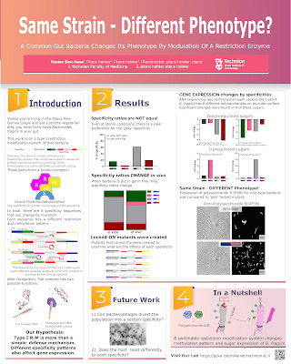
Critique: The great cleave

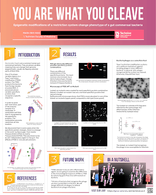
I love seeing how people’s approaches to posters change over time. I am tickled we have a trio of posters from Nadav Ben-Assa. Click any of them to enlarge!

"You are what you cleave" poster 1

This first iteration is a clean, straightforward design that shows lots of good design decisions. There a clean columnar layout. The text and images are integrated. The margins are generous and have lots of white space.

The “In a nutshell” section has a few decisions that I might question. “In a nutshell” is clearly a summary box. The logical places to put a summary are the top left or bottom right. The sidebar in the bottom middle is okay. But I wonder if the sidebar is in that position “because it fit there,” rather then, “This is where it should go, so I’ll make it fit.”

There are some parts of the poster I would like to see more edges aligned.

Perhaps the main issue with this first iteration is that it doesn’t have a lot of personality. The title bar is a sort of unassuming brown. The sort of colour you might expect a 1970s kitchen to be.

Version 2 of this project does not have that issue.

"You are what you cleave" poster 2

Right away, you can see so much more personality! The colour choices are more bold and frankly, more fun. The title has gone from a generic sans serif to a condensed typeface that is bigger and easier to read. The text and images are integrated in a more sophisticated way.

The is still one thing that immediately makes me twitchy. The use of numbers to signpost the reading order is excellent. However, it does draw attention to “5. References” down in the lower right corner. You travel from section “1” to section “4” easily, then... you have to throw the car in reverse and back up all the way to the other side of the poster. Because the poster is in portrait mode, the distance from corner to corner isn’t great, but it’s jarring to glance at the poster and see, “1, 2, 5, 3, 4.”

Just remove the number “5” and the problem goes away. You don’t need to give directions to optional fine print.

Version 3 clearly has some of the same DNA as version 2.

"Same strain - different phenotype?" poster

The signposting issue is gone, and the numbers fall in their expected order! 

The more confident colour choices are starting to extend into the figures used. Compare this to the first poster, and you can see how many more little spots of colour are popping out.

There also seems to be less text in this version than the previous two.

The title, you note, has changed. Nadav liked the title, but it wasn’t connecting with the audience. I think this is a good lesson: you only improve certain things by testing it out on other people.

There is a very clear improvement in graphic design with each version. We can all only hope to improve as much as Nadav!