26 September 2019

Link round-up for September 2019

Cody Christopherson asked students on Twitter:

Which is the worst outcome when you present a poster at a research conference?

The sample size was 944 votes, but Cody included a “Show me results!” option which I have removed in the table below.

FatePercentVotes
Ignored64.7%415
Not being told about serious problems21.8% 142
Criticized to my face 14.4% 94

I am surprised that being ignored won students’ “worst outcome.” I wonder if this is because it may be the most common bad outcome, since many people have reported having no visitors to their poster at least once.

I was also surprised that getting criticized directly was the last choice. The only time I have gotten in trouble on the blog was from PIs who didn’t want their students to be criticized, because they thought it would be too soul-crushing to students. Hey, PIs: maybe your students are tougher than you think.

Hat tip to Dorothy Bishop.

• • • • •

Drew Steen has an entire Twitter thread of “bad on purpose” charts and graphs produced by his students. This one was voted the worst:


Hat tip to Holly Bik.

• • • • •

Now compare the “bad on purpose” plots in the thread above to the sincerely intentioned graphs collected by Jessica Tierney. Jessice has a great thread on the horrors of data visualization, using International Panel on Climate Change graphics. It introduced me to a term I hadn’t heard before: the “carpet plot.” An example is below. It almost has a Christmas-y feel.


I feel like we need a community conversation about visual communication. ... Ask yourself: 1) Do you need all that stuff? 2) Is this cognitively accessible? 3) Is this colorblind friendly? 4) #endrainbow 5) #endneon. If you wouldn’t decorate your living room with that color - why would you use it in a scientific plot (?)

Hat tip to Jarrett Byrnes.

• • • • •

Morgan Simon’s article is titled, “How to be a young woman (or anything other than a grey-haired white man) at a business conference and still get shit done,” but you could probably strike out “business” and replace it with “academic” and a lot of the advice would still apply.

  1. Have an objective.
  2. Your title doesn’t define you.
  3. Watch out for references that make people focus on your age, instead of your abilities.
  4. You already look different — so just be different.
  5. Learn how to make friends — not just network.
  6. Know when to hold them… and when to fold them.
  7. Build new centers of gravity.
My favourite, by a long way, is #5. I think section #4, which includes thoughts on dressing for conferences, may interest many women readers, who often struggle to find a conference wardrobe they are happy with. Hat tip to Nina Simon.

• • • • •

I forgot to add this 3-D poster from a couple of months back.


Pictures by Nicole Ackermans. A “how to” post is waiting in the wings!

• • • • •

I think this is a first on the link round-up: an Instagram thread on posters! This come courtesy of Keighley Reisenauer. Here’s the first pic to get you started:


• • • • •

Kelsi Rutledge shows the benefits of working with professionals. To publicize her description of a new guitarfish species, she had a professional photographer get some fantastic images:

Kelsi Rutledge on beach with guitarfish

Not a poster, but I don’t care.

• • • • •

Back-to-back bookend podcasts! The BOOM (Biomechanics On Our Minds) podcast starts with navigating the conference experience.

The conference conversation continues on the Doctor You podcast, including best and worst conference experiences.

Hat tip to David Shiffman.

• • • • •

A reminder from Laura Bergalls:
“Don’t center long blocks of text.”

I’ve had to address this twice last week - with 2 different clients.

I might write a 500-1000 word article, and they’ll center justify the whole thing, making it extremely difficult to read.

PS - I hope this isn't some kind of new and kooky design trend. If so, it needs to fade, fast.

If you want to center a title or a caption, fine. But there’s a reason your newspaper left-justifies articles.

Readability. Accessibility.

Let’s nip this wannabe trend in the bud.

• • • • •

What do you do with all your conference lanyards? Anne Carpenter wants to know.

What’s the most fun reuse you’ve found for conference lanyards?

My daughters use them as leashes for their stuffed animals.

Hat tip to Justin Kiggins.

• • • • •

Pineapples and Whales have created A scientist’s guide to making presentations. Some of the advice applies to posters, too!

• • • • •

Roberto Keller has a nice Twitter thread showing how scientific figures used to be made.


Lines are inked using a ruling pen. Text is machine-printed, cut out, and glued. The curved dash line is glued into shape from a thin straight strip previously inked. This job was usually done by a professional who was a staff illustrator at the university.

Aren’t you glad you live in the future, where you don’t have to go through this rigamarole? Hat tip to Milton Tan.

• • • • •

And let’s end the month on a positive note from Melody Waring:

I’ve witnessed a beautiful academic moment. A senior academic asked my neighbor if she’s presenting. A grad student, she glanced down and said, “No, I just have a poster.” He leaned forward, warmly, sharing how critical posters have been to his work. Not “Just,” he says.

19 September 2019

Networking flair: Reasons to wear something ridiculous at a conference

Jessica “Rocky” Rohde presents a great networking tip from her Instagram account (lightly edited).

Three reasons you should wear a ridiculous hat like this at your next conference.⁣⁣⁣⁣


This is my cruising hat. Originally, it was for a Halloween costume (Hunter S. Thompson, Fear and Loathing in Las Vegas 😜).


But I wore it every single day of a conference on a cruise ship.⁣⁣⁣⁣⁣⁣⁣ Wearing this “piece of flair” is actually a strategy for meeting people and networking.⁣⁣⁣
⁣⁣
It makes you recognizable

After taking the stage to speak about my work helping scientists become better public speakers, I ended my talk with, “If anybody wants to nerd out about science, tech and engineering, just look for the green hat.” Then I flipped it Justin Timberlake style onto my noggin. ⁣⁣⁣Throughout the rest of the cruise, people would come up to me and say “Oh, you’re the green hat girl!”

⁣⁣It makes you approachable

At a conference when you meet a new person every few minutes, you become exhausted of explaining where you are from and what you do over and over. Wearing something unusual gives us something unexpected to talk about.⁣⁣⁣⁣⁣⁣⁣
⁣⁣
Them: “What’s with the hat?” ⁣⁣⁣⁣⁣⁣⁣
Me: “This is part of the uniform. I’m a cruise marshal. Don’t tell anyone, though!”⁣⁣⁣⁣⁣⁣⁣
⁣⁣
It tells people something about you

I’m a little bit silly (understatement of the year 🙃) and people know before I even open my mouth that I’m, well, a little different.⁣⁣⁣⁣
⁣⁣
Your “flair” doesn't have to be a hat. Space pants work great, too. 😁 If you want to be a little more subtle, it can be an interesting shirt, tie, jewelry, or a pin. A colleague of mine wears his conference badge on Mardi Gras bead necklaces!⁣⁣⁣⁣⁣⁣⁣⁣⁣

I have done similar things to Rocky. I’ve worn a kilt at conferences. I’ve had blue hair at conferences. And it works as a conversation starter. A distinctive piece of clothing, just like a poster, can act as a social object.

But Charles Cong Xu went next level when he presented a poster about spider web DNA at the recent joint meeting of The Canadian Society for Ecology & Evolution, the Entomological Society of Canada, and the Acadian Entomological Society (EcoEvoEnto2019) meeting.


This, my friends, is committing to your theme. And you better believe there were a lot of pictures of Charles if you were following the conference hashtag. I reached out to Charles and asked about the experience.

“Go big or go home” was why I decided to dress up and have some fun with it. The socks and compression shirt worked well, but the mask was stuffy. I ended up just putting it on every once in a while when people wanted to take photos.

I did not get any pushback about the costume, at least none that I’m aware of. On the contrary, the poster and costume drew a lot of positive attention at the conference as Twitter would testify. ... I think it’s a good sign when people want to take selfies with you and your poster.

(I will have another post focusing on Charles’s poster soon!)

This clearly worked for Charles, but not everyone will have the nerve for full blown cosplay.

Even if you want do something this full on, you have to know the conference and know the crowd to figure out if you can pull it off without damaging yourself professionally. Navigating a conference as a professional means blending in to some degree. And while many academics claim not to care what a poster presenter looks like, they can be judgey about it.

Do you wear something that people always comment on?

External links

Rocky Rohde

Related posts

Conversation piece

EcoEvoEnto photo by Canadian Society for Ecology & Evolution twitter account 

12 September 2019

Freedom to change from your abstract


Jennifer Rohn asked:

Academic STEM Twitter: how far have you ever strayed from your submitted abstract when it comes time to write the talk or create the poster? Or turn it around: if you went to a talk/poster and the presenter included extra information/some tangents, would this bother you?

For me, the real question is not whether people can or should change or add content, but why it happens so rarely.

In the world of academic conferences, abstracts are usually written months in advance. 

  • The Society for Integrative and Comparative Biology abstract deadline was 4 September, and the meeting will be held 3 January, which is four months away.
  • The Society for Neuroscience abstract deadline was 3 May, and the meeting starts 19 October. That’s five months out.
  • The American Geophysical Union abstract deadline was 31 July for a 9 December meeting. Also five months out.

With that much time between when the abstract is submitted, it should be no surprise that you may have learned a few things since the abstract was submitted. You may have collected new data. You may have completed an analysis. You may have changed your mind.

Because there are no poster police, there is no reason to limit yourself to what was on the abstract. 

The only thing that I can see a small reason for keeping the same is the title. People who are looking for a poster with a particular title might be confused if the title bore no resemblance to the original. But if the deep structure of the topic is the same, reworking the title should be okay.

Change whatever you need.

05 September 2019

Citing posters

Kevin polled his Twitter followers with the burning question, ¨Are poster session presentations citable in manuscripts?”

Poll results to, "Are poster session presentations citable in manuscripts?" 50% Yes, 50% No, 107 votes

The audience was spectacularly unhelpful, splitting straight down the middle. 50% said yes, 50% said no.

The way the question was posed was a bit vague. It’s not clear if Kevin was asking whether it is possible to cite posters or whether it is ever a good idea to do so.

If the question was whether it is possible to cite a poster: Yes, it is, and half the survey respondents were wrong. 

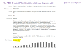
Google Scholar entry for Weathers et al. 1993, showing "Total citations: Cited by 4830"

A 1993 poster by Frank Weathers and colleagues has been cited over 4,000 times, according to Google Scholar. (Hat tip to Steve Lancaster.) This is a strong candidate for the most cited poster of all time

Proof positive that posters can be cited... if editors allow it. Some journals are fussy about what they will allow in their reference lists and only allow peer reviewed papers.

Whether posters should be cited depends on whether posters are ephemera or part of the scientific record.

The argument for “No citing posters” assume that posters are ephemeral and center on whether a claim is verifiable. This seems to be an extension of a “Raw data or it didn’t happen” position of some open science advocates. Since it’s usually an abstract that is published, not the actual poster, the record may not be as good as a complete paper. But even published papers vary in quality, so saying “no posters” is an arbitrary cut-off line. There are poster abstracts I would trust over some published papers.

Some posters don’t even have a published abstract. But some journals permit “personal communications,” and the poster could cited that way rather than a presentation.

Foster and colleagues (2019) argue that conference posters are part of the scientific record. Some conferences publish conference abstracts in journals, so the abstract is as findable as any journal article. People can self-archive posters one their own websites, institutional repositories, Figshare, and more.

I’ve sometimes cited posters that presented earlier versions of work in final manuscript I submitted to a journal, saying, “This work has been published in abstract.” Why do this? Just to pump my citation count? No. Because you cite prior work. That’s the point of citations. I want people to be able to track the progress of the work. If the conference abstract is findable, citing the abstract provides a way for someone who stumbles across the abstract to find the final version of the work in a journal.

There is a lot being said these days in biology about how preprints are speeding up work. And a recent conversation on twitter about a trainee whose boss was blocking publication of research led to a lot of people bemoaning wasted resources.

You want to talk about speeding things up and reducing wasted effort? Let’s talk posters.

A systematic Cochrane review found less than half of conference presentations are published, and posters are less likely to be published (Scherer et al. 2018). This means that conference posters may be the only record of some experiment or finding.


If speed is that big a concern to you:

  1. Archive your posters. Make the findable somehow.
  2. Publish work presented on posters. Do not let your ego get in the way. It the research was competent, find a home for it, regardless of whether it’s an “interesting” result or not.
  3. Cite posters. Don’t wait until someone publishes a peer reviewed paper, because it may never come. And push back on editors who don’t want to cite posters.

Posters are part of the scientific record, and we need to start treating them as such.

References

Foster C, Wager E, Marchington J, Patel M, Banner S, Kennard NC, Panayi A, Stacey R, The GPCAP Working Group. 2019. Good practice for conference abstracts and presentations: GPCAP. Research Integrity and Peer Review 4(1): 11. https://doi.org/10.1186/s41073-019-0070-x

Scherer RW, Meerpohl JJ, Pfeifer N, Schmucker C, Schwarzer G, von Elm, E. 2018. Full publication of results initially presented in abstracts. Cochrane Database of Systematic Reviews, MR000005. https://doi.org/10.1002/14651858.MR000005.pub4

Weathers, F.W., Litz, B.T., Herman, D.S., Huska, J.A. & Keane, T.M. 1993. The PTSD Checklist (PCL): Reliability, validity, and diagnostic utility. San Antonio, Texas, USA.over