28 December 2017

Link round-up for December 2017

One of the problems with free fonts is that they often don’t have special characters that are necessary for proper display of characters from other languages, or symbols.


Google Noto is a series of fonts meant to have almost every character (and emoji!) in as many languages as possible. When I scrolled down the list and saw, “Canadian aboriginal,” I knew they were serious.


I downloaded Noto Sans, and was impressed.

Not only are there over 30 variations of Noto Sans, including thin, bold, condensed, extended, and combinations thereof, going into “Insert symbol” to see the individual characters is eye-opening. You think you’re a typographic sophisticate for recognizing and using an interrobang? Noto has that, and an inverted interrobang. There are combinations of letters and accents and umlauts and currency symbols I have never seen before.

The range of options is, frankly, staggering. There is no font package that comes Windows standard with this many options. Buying a font package with this many options would usually cost you many hundreds of dollars.

And Noto fonts are all free.

You have no excuse to use a lower case letter x in place of a multiplication sign, or not put an accent in a co-author's name, ever again.

Hat tip to Robert J. Sawyer.

• • • • •

Asada and colleagues have a new paper reviewing effective graphs, particularly in the are of public health. They’re very big into dot charts. I’m not convinced by their representation of variation in dot charts, though.


Hat tip to Hilda Bastian.

• • • • •

Another hat tip to Hilda for spotting a timeline of data visualizations and graphs.

• • • • •

Tony Roepke has good advice:

Note to poster presenters...don’t go out for a cigarette break right before your poster session.

14 December 2017

Critique: Badger parasites

Today’s poster comes from Rachel Byrne. Click to enlarge!


Rachel was kind enough to respond to my request to share this, which I think is just a delightful work. It demonstrates the old adage that necessity is often the parent of invention. This wasn’t supposed to be a poster. Rachel explains (lightly edited):

To be completely honest I had applied for a talk at the 32nd Mustelid Colloquium held in Lyon, but they didn’t have space so offered me a poster. That’s when I began to panic. I am just one year into my project and did not have any real statistic analysis (which I think is often present on posters). Because my topic is very much about parasites, I also was a little worried that a bunch of behavioural ecologists and mustelid enthusiasts wouldn’t be that interested/familiar with parasitology jargon, so I might have to spend half my poster space on definitions etc.

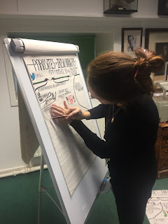
As badgers live in underground burrow systems called setts, I wanted to use this as a way of laying out my poster. As I’m a keen (but not very good) artist I played around with the idea of drawing out my poster.

Rachel Byrne drawing her conference poster.
Author Dan Roam is often faced with people who say, “I can’t draw.” He replies, “Everyone can draw, even people who know they can’t.” I think Rachel undersells her skills. I’ve lettered comics by hand (Time City #5), and it’s not easy to get hand drawn text to look as as consistent and readable as Rachel did here.

Rachel continues:

I wanted it to be very clear and easy to read and, and very importantly, eye catching. I posted a preview on Twitter and it received a very positive response. I think at poster session the key is getting people over to talk to you and ask questions. I decided to include my twitter handle rather than my email address which I think demonstrates the move for a more social and communicative science community.


To quote Dan Roam again, “Hand-drawn pictures make people smile, and smiling people think better.” And it’s hard not to look at Rachel’s poster and not smile. There is a charm to something so obviously personal.

In a time when computers are everywhere, and it’s easy to pop together a few pictures and text blocks in a computer file, something hand drawn is going to be remarkable. It will be worth talking about.

And people were definitely talking. Despite being started in a moment of slight desperation. Rachel’s efforts were rewarded with a first place prize poster!

Rachel may not go that route every time, though:

I definitely won’t be drawing every poster for conferences but I think if it’s a friendly and accepting group, it can be very fun!

07 December 2017

Critique: baby heads

Today’s poster comes to us courtesy of Laura Steinmann, presented at the 2018 American Nurses Association conference. Click to enlarge!


She writes:

I developed a 4 foot by 8 foot poster which is crammed with great info, and that’s the problem. ... The poster is less data and more instructional, based on two publications I wrote to teach providers how to recognize asymmetry.

Laura went on to say that she used a poster template provided on a commercial site. Coincidentally, the last talk I gave on posters, one of the questions from the end was about whether I knew any sites with good poster templates. This is a good example of why I try to steer people away from templates. People slap up templates that are... not necessarily very good.

Let’s look at just the template background, with the content removed:


The space alloted for the title and author is tiny. The space between the columns, and the margins around them, are also tiny. A poster maker would be better served if those areas were larger:


I’m still not crazy about this as a template for a poster, but I think it would have gotten someone off to a better start.

I agree with Laura’s self assessment: this poster is crammed. I often complain that people try to turn a manuscript into a poster, and in this case, there are two manuscripts residing on this poster. While I absolutely sympathize with the desire to tell a complete story, the complete story exists in the papers. They do not need to exist in the poster.

The first column is perhaps both the best. It is the best because it has a clear, wonderful diagram that Laura created (highlighted at right). Laura’s diagrams are very good, and I wish they were bigger and more prominent. They convey so much information.

The first column, unfortunately, also features some inconsistent typesetting. And it is crammed. For instance, several paragraphs in the first column might be cut down to a couple of sentences: “Infants’ skull growth is affected by internal factors, such as the normal malleability of the skull. Skull growth is also affected by external factors, such as the positioning of infants.”

There are about 1,800 words on this poster. While I personally never aim for some particular arbitrary target number, other people have had good success with posters containing a few hundred words.

Ruthless editing is hard. But that is what this poster needed.

Update: Laura sent me her revised version of the poster. Click to enlarge!


So. Much. Better.

Yes, it is still crammed. I would still want to cut down the number of words and resize some things. For instance, the references might be printed in a smaller point size. That would free up some space to make the takeaway messages in that column bigger and bolder for the viewer.

But the title is readable from a distance. The images are bigger. There’s less distracting background. The typography is consistent. It’s more inviting and interesting looking.

I particularly like the thin line running along the left side of the headings. It provides a little definition to the columns, but is subtle, and is a nice graphic touch.