

Purav writes:
It combines some elements from Mike Morrison’s better poster, Bret Victor’s Seeing Spaces poster, and my own touches.
If displayed in physical form, I would print a very large poster to see the smaller cells more easily. The Post-It notes are for viewers to write some comments/feedback after the presentation. A template and associated files are on the OSF website.
It’s interesting that Mike Morrison’s YouTube video is influencing poster creation even though it’s only been out for a few weeks. And we haven’t even hit peak conference season yet.
This poster is an interesting attempt to fulfill the needs of different readers simultaneously: the ones who are happy to read on their own and the ones who want “the tour” from the presenter.
I like that this poster cleanly and clearly separates the columns. The wide margins signal that each column is serving a different purpose. The headings on the left and right spell out what each column is for.
The downside of “two posters in one” is that there is a lot here, and it does not look like a quick read.
Fortunately, Patel isn’t afraid to leave some white space down at the bottom, which provides a bit of lightness to the poster. All the logos and QR codes are sensibly placed down in the bottom corners, too, where they won’t distract from the main content.
The left and right corners mirror each other, which is a nice touch. I don’t mind the redundancy, because it does mean that if someone is working on the left side of the poster, someone on the right is easily able to snap a QR code without disturbing the other reader.
The downside of this style is that the central point, “Machine learning enhances perceptual fluency in chemistry,” gets a little lost. That title is in a bigger block than the headings on either side of it, but it’s short-changed by the diagram on the right taking up space. The diagram isn’t adding a lot of context or information.
Extending the blue title bar and putting the diagram on top of it makes the title carry more visual weight, and solves an alignment problem at the same time. All the bars now align on the right.

The low contrast between the purple on blue downplays the diagram and creates some unintended striping effects. Either a different diagram or a little colour change might help. I am tempted to removed the diagram entirely.
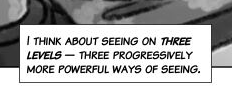
The brush-style type is clearly taken from the “Seeing spaces” poster, referenced above. In the “Seeing spaces” poster, the brush font is paired with a more traditional “speedball” comic lettering for the main text. The comic font has no lowercase, but it does allow for emphasis.
In Purav’s poster, the brush-style is used throughout, and it hurts the poster’s readability. It’s a much narrower typeface, which tends to make sentences look more like grey lines a series of words. The font has no lowercase. The font has no emphasis or variation.

This poster is further from the comic style than the “Seeing spaces” poster, so there is no strong reason to use a typeface that emulates hand lettering here. A condensed font with lowercase letters might be a better choice.


No comments:
Post a Comment